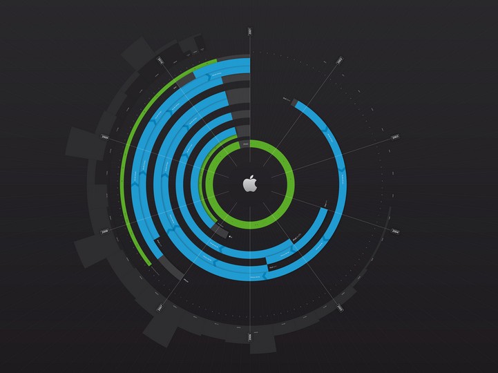
Infographic: The iDevice Timeline
August 24, 2010
After their great comparison of iPhone prices accross the world, iFun.de found another great infographic today, this time focusing on the history of Apple's "lifestyle division". It's a very well done 9362 pixel-large visualization of all the different iDevices Apple came up over the years, their different iterations, how long they lasted and so on.
I'm definitely going to look into having this made into a poster for my office. Check it out on Flickr by hitting the image above, or click here for the full-res iOS-friendly PDF version.
