The principles behind the design are:

CC Tracker Pro
What is it about?
The principles behind the design are:

App Screenshots


App Store Description
The principles behind the design are:
1. User data is valuable.
We use Apple technology iCloud to store your data reliable and safely on Apple server; We dig out the underlying value for your data and present it to you.
2. The workout process should be simple.
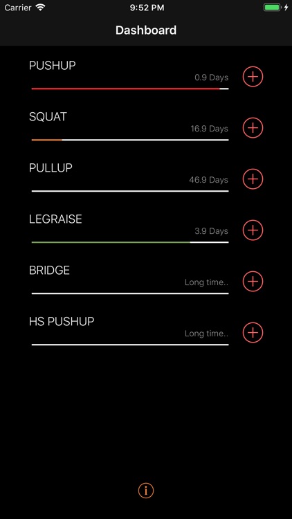
Dashboard view shows you an overview of previous training date to give you a clue on which type of workout needs to be trained more badly, so that you do not need to remember or think about which workout type you should perform.
Adding workout record should be very simple. Single click on dashboard view to add record, swipe down on add record view to save. This makes adding record really convenient.
Description:
1. Dashboard view
1.1 An overview of previous training date to give you a clue on which type of workout needs to be trained more badly.
1.2 "i" Button at the bottom of Dashboard
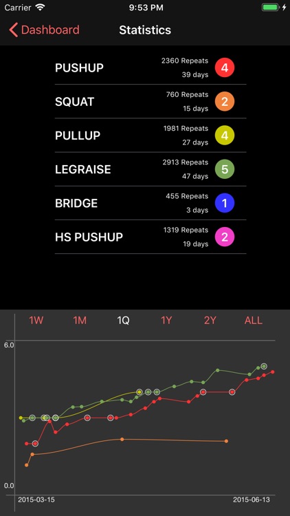
1.2.1 Tap the button, you will enter summary view, also with chart view for all the workout types.
1.2.2 The color of this button indicates the icloud sync status: green for cync completed, orange for cync ongoing, red for cync error.
2. Intelligent Workout record adding:
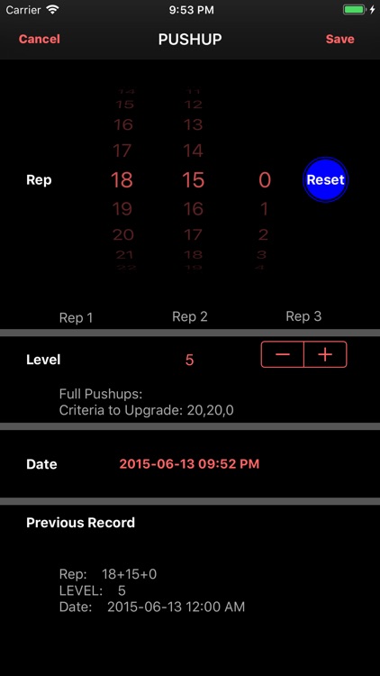
2.1 Previous workout repeats and time is presented in the same view.
2.2 Current training level/name/target repeats and current date/time auto set.
2.3 Swipe down to save, adding record becoming really convenient.
2.4 A button designed to auto fill previous record, or reset to zeros.
3. Table View: show all the training history
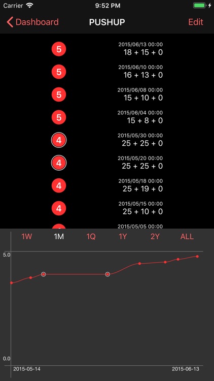
3.1 Training level for that workout is highlighted in big circle.
3.2 The circle will have an outer circle if it meets upgrade criteria.
3.3 You can delete any record freely.
4. Chart View (at the bottom of table view, tap the table view to toggle hide/show chart view):
4.1 Progress Curve Chart:
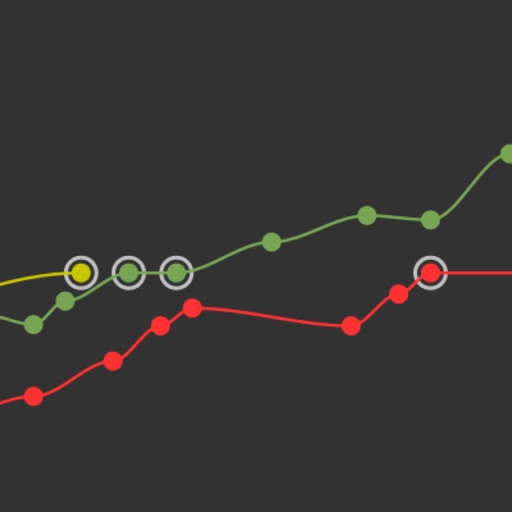
4.1.1 If the training on that record is ready to upgrade to next level, the dot will be marked with an outer circle.
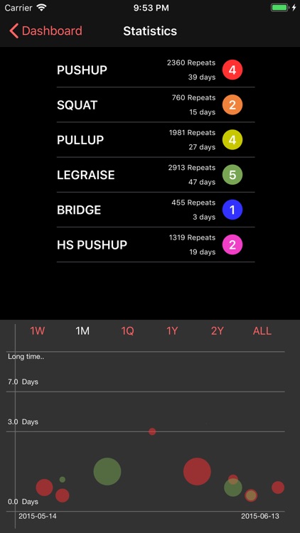
4.2 Recovery Time Effect Chart:
4.2.1 y position indicates recovery time (rest time from previous workout).
4.2.2 dot size indicates how much progress is made (progress change from previous workout)
4.2.3 by overview of where the larger dot located, you will find the best recovery time to make the best effect. This feature will help you a lot to optimize your workout intervals: it is based on your own historical data.
4.3 Tap any position of the chart view, to switch between above 2 chart types.
4.4 View chart from different date ranges【Pro】
AppAdvice does not own this application and only provides images and links contained in the iTunes Search API, to help our users find the best apps to download. If you are the developer of this app and would like your information removed, please send a request to takedown@appadvice.com and your information will be removed.