Closing The Book On Apple's 'Cheesy' GUI Metaphors? What's The Alternative?
May 28, 2012
Early last week, word came around about a recent Jony Ive interview wherein Apple's design chief purportedly "winced" at the mention of his company's reliance on digital skeuomorphs.
What's a skeuomorph, you ask? Well, if you didn't feel like wading through the complete history at the link above, here's the short version as it applies to Apple and iOS (via Wikipedia):
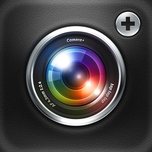
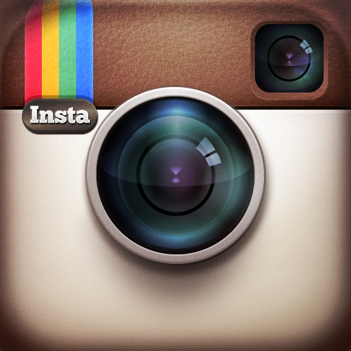
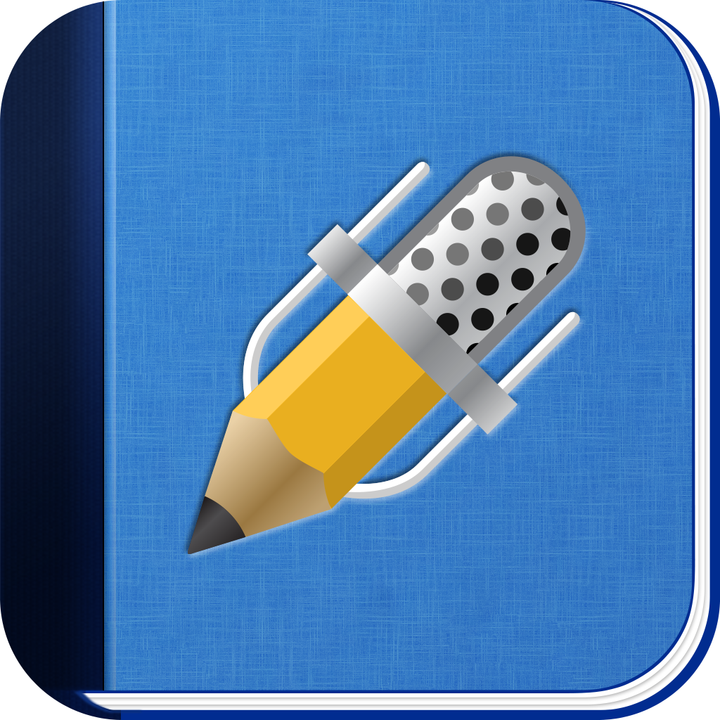
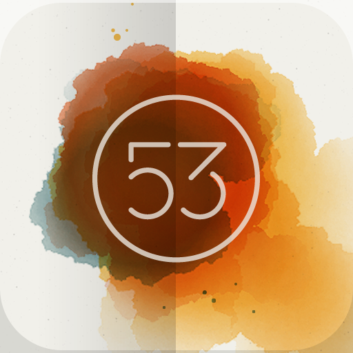
[A skeuomorph] is a derivative object that retains ornamental design cues to a structure that was necessary in the original. ... [Examples include] pictures of buttons that appear to move up and down, files and folders that look like real world objects, added to operating systems that formerly had a command line input. ... Functional input controls like knobs, buttons, switches and sliders are all careful duplicates of the ones on the original physical device being emulated. Even elements of the original that serve no function, like handles, screws and ventilation holes are graphically reproduced.In the hours following Ive's interpreted disapproval, every tech outlet on the Internet ran with the story, similarly (and summarily) bashing the concept. Fandroids and iSheep enjoyed a rare meeting of minds as the blogosphere jointly derided those real-life software carryovers, calling them trite, tacky, gimmicky, and fundamentally flawed in our fast-moving modern times. Slow down, folks! For those of you firmly embedded on the side of "against," ask yourself this one important question: If skeuomorphs are out, what is a more appropriate -- and more useful -- alternative? Consider the history of computing itself -- Beyond the earliest command-line operating systems, every mainstream (or even partially mainstream) OS had to be made accessible. That's why we got the GUI, the desktop, the free-floating file and folder scattered about the computer screen. For the last 20-plus years, the personal computing environment was one giant analog metaphor. And it still is. So why is Apple getting all the flak? How has Apple seemingly overdone the idea? The first bit's easy to answer: Apple is Apple. The company's the king of the hill and wears a target on its back (and front and sides and top and bottom). As for the second part, I reject the premise entirely. Apple's implementation of skeuomorphic ideals is far from overdone. And what vestiges remain are hardly inappropriate. At least, for the most part. Consider iOS itself. Its basic presentation is quite purpose-built and unadorned. Sure, it has app icons and settings switches, but it's really just a great big list that gets you where you want to go. Digital. Straightforward. Nice. Fine. Consider even the stock apps Apple offers between the iPhone and iPad: App Store, Calculator, Calendar, Camera, Clock, Compass, Contacts, FaceTime, Game Center, iTunes, Mail, Maps, Messages, Music, Newsstand, Notes, Phone, Photo Booth, Photos, Reminders, Safari, Settings, Stocks, Videos, Voice Memos, Weather, and YouTube. Of these 27, only 13 feature what I'd characterize as avoidable instances of skeuomorphics. Here they are: Calculator looks like a typical (albeit stylized) physical calculator array. Calendar has a tan, paper-worn calendar look, with page-turns that emulate actual turning pages. Camera has a brief shutter animation as its load screen. Compass is a dynamic animated... compass. Contacts looks like an old contacts booklet, replete with alphabetical tabs, hardbound borders, and a threaded spine. Game Center is built upon a backdrop of green parlor-room felt and wooden frames. Maps has a single bent-up corner where you can access more options. Other than that, there's nothing skeuomorphic about it. Music has play, fast-forward, and rewind buttons -- What music player doesn't? It also has an ever-so-tiny wood-like border. Newsstand probably shouldn't be included on this list, as it's not an app per se, but here it is. When you tap on the icon, a faux bookshelf appears. You might have a magazine or two on it. Notes, perhaps the most heavy-handed of the skeuomorph players, looks like a classic yellow note pad. Photo Booth uses a drawn curtain for its loading animation. Reminders sports a notebook paper-like portion on the righthand side. Voice Memos features a big metal microphone front and center. Most of these examples are very minor "offenders," to be sure. But again, what are the alternatives, and what are the benefits to these alternatives? Would the lack of a few imitative pixels to the left and right of the Music app change anything functionally or intuitively? No. Would Camera and Photo Booth be better without their loading animations? Of course not. Would Maps be more accessible without the flair of its flaring corner? Hardly. Indeed, of all these apps, the only ones that truly overdo the skeuomorphic element are Contacts, Game Center, and Notes. The first is a functional disaster (tens of thousands of neglected pixels in portrait mode and an overtly misleading lack of turnable pages), the second an aesthetic one (if only because it's so garish to look at). The third, though, is easier on the eyes and is a perfectly artistic metaphor. Could Notes look like a Plain Jane word processor with a toolbar up top and white space below? Sure. Should it? Not if you ask me. Of course, Apple could make a concerted effort to eschew all skeuomorphs, and it could be done. They'd also be the first big-time software maker to do so. Each app could look like every other app, with flat, monotone, monotonous backgrounds and clear, unembellished, high-contrast text on top. There'd be no need for different colors or unique app-by-app appearances, for altering such aspects would -- without the design of skeuomorphism in mind (and in action) -- be completely arbitrary, anyways. And arbitrary is unnecessary. Still, Apple could do it. But in considering this fact and promoting its undertaking, you need to understand one very important thing: Apple's stock apps -- with nearly no exceptions -- are demos. Back in 2007, before Steve Jobs realized and embraced the power of a third party app-driven ecosystem, this may not have been the case. It absolutely is now. So why not have fun with these stock offerings? After all, Apple's already enjoying those stock offerings, and the company doesn't need to rely on its nonessential secondary software the way it leans on Ive's primary hardware. To Apple, when it comes to its own apps, the idea is to get people saying "How clever!" and "Neat!" and "How cool is that?" You won't get the same reaction with a blinking cursor on a blacked-out screen. Plus, if a few folks don't like what they see, all that's likely to happen is that they turn to the App Store and procure a more suitable replacement. The customer's happy, a developer gets paid, and Apple takes their 30 percent cut. It's a literal win-win-win. And think about this: If skeuomorphs are such an obvious and infuriating boondoggle, why in the world are the highest-rated and most critically acclaimed third-party utilities almost invariably built with real-world emulation in mind? Titles like Artrage, Calculator Pro, Camera+, Hipstamatic, Instagram, MotionX GPS Drive, Night Stand HD, Notability, Paper, Penultimate, Virtuoso Piano, and countless other App Store hits are all virtually founded on skeuomorphic principles. Remember, it was only after Amazon brought animated swipes to its Kindle app that people finally quit complaining. They simply wanted to turn the page. Just not on skeuomorphism.