You are using an outdated browser. Please
upgrade your browser to improve your experience.

Pareto Chart is a type of chart in determining and displaying roughly 80% of the effects come from the 20% of the causes

Lean Pareto Chart Rpt
by MCS Media, Inc.


What is it about?
Pareto Chart is a type of chart in determining and displaying roughly 80% of the effects come from the 20% of the causes. This app provides fundamental information on how the Pareto Chart turns "data" into useful information in a standardized, customizable, and sharable format on the cloud. The Pareto Chart uses a bar chart format to visualize the Pareto principle which states that 20% of the sources cause 80% of the problems. This app is designed for anyone who wants to effectively visualize data in analyzing processes in a continuous improvement or problem-solving project. The Pareto Chart will present the data or issues in descending order of importance, which can be used for displaying before and after improvement initiatives.
App Screenshots


App Store Description
Pareto Chart is a type of chart in determining and displaying roughly 80% of the effects come from the 20% of the causes. This app provides fundamental information on how the Pareto Chart turns "data" into useful information in a standardized, customizable, and sharable format on the cloud. The Pareto Chart uses a bar chart format to visualize the Pareto principle which states that 20% of the sources cause 80% of the problems. This app is designed for anyone who wants to effectively visualize data in analyzing processes in a continuous improvement or problem-solving project. The Pareto Chart will present the data or issues in descending order of importance, which can be used for displaying before and after improvement initiatives.
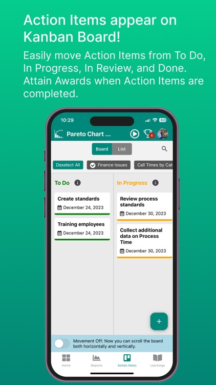
The Dynamic Kanban Action Item Board allows Action Items to be visually managed using 4 “buckets” of To Do, In Progress, In Review, and Done allowing for Assignor to track progress by a simple drag and drop function to each bucket. Emails are automatically sent to Assignee(s) for all Action Items.
The 4 buckets functions as follows:
To Do – The Assignor will create the Action Item and reside there until the Assignee receives the email notification and acknowledges receipt to the Assignor via email or text. The Assignor then moves it to In Progress.
In Progress – The Assignee will work on the Action Item and once completed notify the Assignor. The Assignor then moves it to In Review.
In Review – The Assignor will ensure the Action Item is completed and move it to Done, or if not completed, make comments and move it back to In Progress, and subsequently notify the Assignee.
Done – The Assignor moves the Action Item to Done once they are satisfied that it has been fully completed.
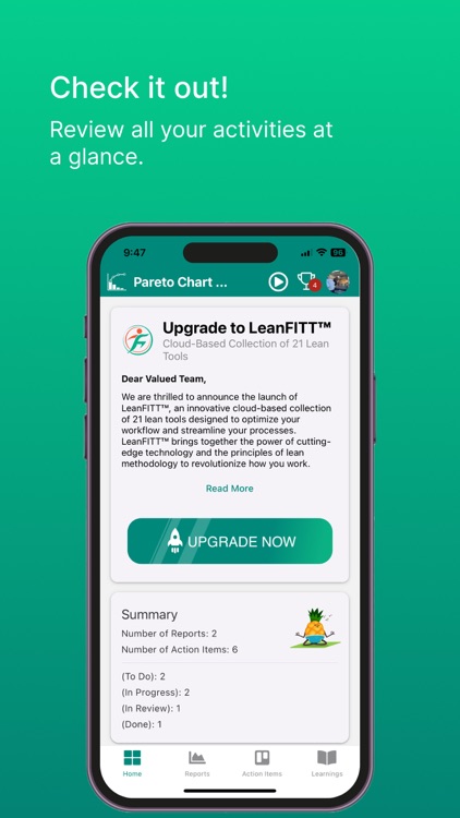
Beyond educational purposes, this app provides a platform for creating a customizable and standardized use of the Pareto Chart report and Action Item tracking.
This app features:
An overview (Learnings) of the Pareto Chart.
A standardized approach and application of the Pareto Chart Report.
Access to Sensei tips for further understanding.
Access to the Pareto Chart tool/report to create x and y axis labels, add values and descriptions for each label identified.
Receive awards for completing Action Items, Reports, etc.
Record, assign, and track Action Items with the visual management Kanban board.
View a Pareto Chart report displaying all data points relative to the Cumulative Percentage.
Create the Pareto Chart report and share via PDF.
Take a Quiz to determine knowledge attainment.
Review a video tutorial to assist in understanding how the app works.
Disclaimer:
AppAdvice does not own this application and only provides images and links contained in the iTunes Search API, to help our users find the best apps to download. If you are the developer of this app and would like your information removed, please send a request to takedown@appadvice.com and your information will be removed.
AppAdvice does not own this application and only provides images and links contained in the iTunes Search API, to help our users find the best apps to download. If you are the developer of this app and would like your information removed, please send a request to takedown@appadvice.com and your information will be removed.