You are using an outdated browser. Please
upgrade your browser to improve your experience.

The only Renko charting app on the store

Renko Charts - Yahoo ed.
by IGOR VLASOV
What is it about?
The only Renko charting app on the store! It uses Yahoo Finance data feed as a source. So if a stock is listed in Yahoo Finance, you can quickly and easily see its daily, weekly, or monthly Renko chart.
App Screenshots
App Store Description
The only Renko charting app on the store! It uses Yahoo Finance data feed as a source. So if a stock is listed in Yahoo Finance, you can quickly and easily see its daily, weekly, or monthly Renko chart.
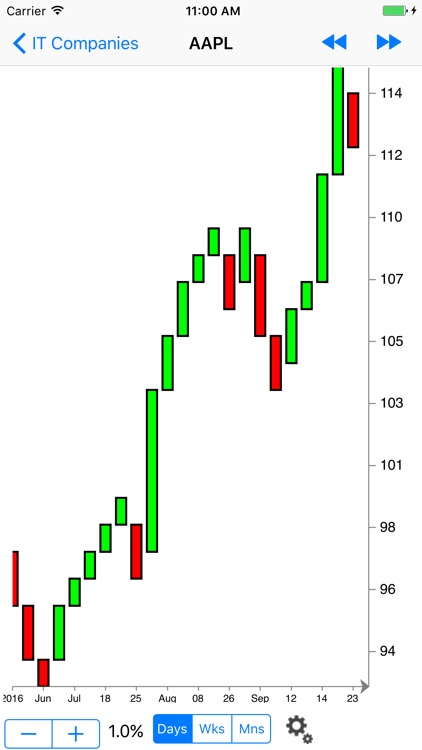
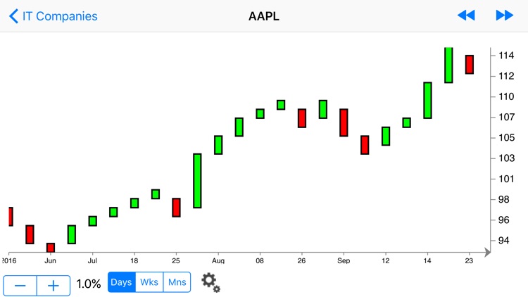
Renko charts are price charts with rising and falling diagonal lines of boxes that are either filled or hollow. Renko charts are "time independent" charts that do not have constantly spaced time axes.
The word "Renko" comes from "Renga", the Japanese word for "brick". The filled and hollow squares that make up a Renko chart are often referred to as "bricks." Renko charts were popularized by Steve Nison in his book Beyond Candlesticks.
Renko charts have a pre-determined "Brick Size" that is used to determine when new bricks are added to the chart. If prices move more than the Brick Size above the top (or below the bottom) of the last brick on the chart, a new brick is added in the next chart column. Hollow bricks are added if prices are rising. Black bricks are added if prices are falling. Only one type of brick can be added per time period. Bricks are always with their corners touching and no more than one brick may occupy each chart column.
It's important to note that prices may exceed the top (or bottom) of the current brick. Again, new bricks are only added when prices completely "fill" the brick. For example, for a 5-point chart, if prices rise from 98 to 102, the hollow brick that goes from 95 to 100 is added to the chart BUT the hollow brick that goes from 100 to 105 is NOT DRAWN. The Renko chart will give the impression that prices stopped at 100.
It's also important to remember that Renko charts may not change for several time periods. Prices have to rise or fall "significantly" in order for bricks to be added.
Green bricks are bullish, Red bricks are bearish - that's the simplest interpretation of Renko charts. Renko charts may be most useful in identifying trends and trend direction. Because they screen out moves that are less than the brick size, trends are much easier to spot and follow. In order to avoid whiplash periods, some people wait until 2 or 3 bricks appear in a new direction before taking a position.
In the app size of the brick is defined by close price percentage.
Disclaimer:
AppAdvice does not own this application and only provides images and links contained in the iTunes Search API, to help our users find the best apps to download. If you are the developer of this app and would like your information removed, please send a request to takedown@appadvice.com and your information will be removed.
AppAdvice does not own this application and only provides images and links contained in the iTunes Search API, to help our users find the best apps to download. If you are the developer of this app and would like your information removed, please send a request to takedown@appadvice.com and your information will be removed.