Viaduct
Viaduct
What is it about?
Viaduct

App Screenshots


App Store Description
Viaduct
There is no reason why studying at university has to be as unenjoyable and as inefficient as it is and there is no reason why you should simply accept the digital learning environment that you are given. Yes, it has all the content and tools that you need but it is far too unenjoyable to use and simply isn’t good enough. It needs to be fixed but you don’t need to replace it… streamline it with Viaduct.
Sign up with your university email on either mobile or web, move through our two-step onboarding process and have access to all of your assessments, classes, content and course mates in a system that can be navigated in seconds and with two taps. This is exactly how digital learning was meant to be.
Navigation:
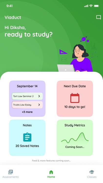
- Viaduct opens on the dashboard which contains day planner, notes, next assessment, study metrics, profile and chat – click on any of the boxes or icons to open their interface or swipe to access the assessments and classes overview sections.
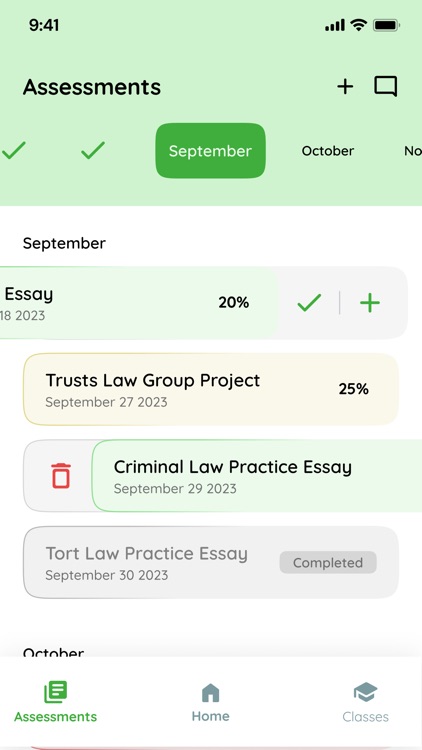
- Swipe right for 'assessments' where you will find all of your assessments. Use the slider at the top or scroll to move to past or future dates.
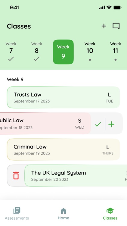
- Swipe left for 'classes' where you will find all of your classes. Use the slider at the top or scroll to move to past or future dates.
- Swipe on an assessment or class to add it to your day’s plan or mark it as complete. Or, when using the web, tap on the three dots to reveal the action buttons.
- Tap an assessment or class to open its interaction area and access all relevant content that you have stored. The more content that you record, the better trained you study assistant AI will be.
Key Features:
1. Dashboard – Your complete study overview. Everything is accessible from your dashboard and from here you can see your progress and decide what to study.
2. Day Planner – Where you can schedule each day’s studying. Add assessments and classes or create one off tasks. Tap on an assessment, class or task to move to its interaction area and study it.
3. Next Assessment – real time display of how long left until your next submission.
4. Assessments Area – see all of your assessments in a single screen. Organised according to months and coloured according to progress. See the due date and the weighting of each assessment. Mark them as complete to move through your month’s assessments and to stay on top of your studying.
5. Classes Area – see all of your classes in a single screen. Organised according to weeks and coloured according to progress. See the scheduled date and the type of class. Mark them as complete once you understand the topic.
6. Interaction Area – Each class and assessment has its own interaction area. This is where content and tools are stored for it. You may share the same assessment as another student but unless you choose to collaborate, this is your interaction area and your content. This is different to a typical storage system – it is designed like a chat. This is partly because we want to allow you to sort the content that you see and to view the most recent content and partly because it isn’t just for documents and links but for reminders, thoughts and suggestions. It also allows you to collaborate on a class or assessment with course mates and AI in real-time. At the bottom of the interaction area is a note. Add content to the note and either keep it at the bottom of send it into the interaction area for another time.
7. Chat – this is a chat; you know what it does.
8. Profile – Add a photo, manage your modules and course and make sure you appear as you want to appear to your course mates.
These features and many more are accessible on both mobile and web. If on web, use in full screen mode for the best experience.
But we aren’t finished yet. Stay tuned for more.
AppAdvice does not own this application and only provides images and links contained in the iTunes Search API, to help our users find the best apps to download. If you are the developer of this app and would like your information removed, please send a request to takedown@appadvice.com and your information will be removed.