Oh no, where'd the Apple Store go?
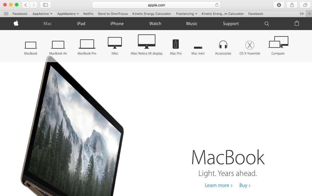
If you look at Apple’s Web page today and try to find the Store icon, you might think at first that Cupertino has done away with its online shopping presence for some reason. With a new redesign of Apple’s website, the Store button has been removed from the top navigation bar, but you can still shop from the page.
Instead of having a Web page dedicated to its online store, Apple has opted to integrate the shopping experience into its product pages. With the revamped site, you do all of your purchasing from the same location that you do your research. Of course, the “Buy” links were there before, but now those are the only ways to add items into your shopping bag.
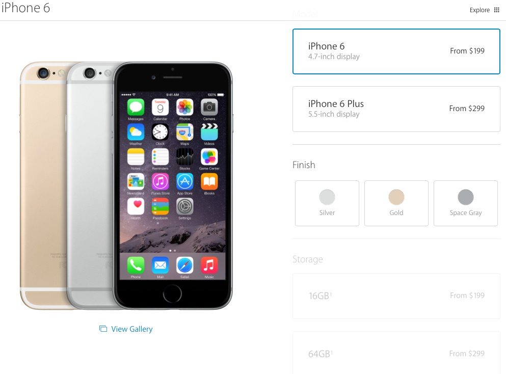
The product pages have been redesigned as well, now featuring very little text. Instead, the Web pages for the Mac, iPad, and iPhone display large images of the entire product families. Each item has links to “Learn more” or “Buy,” but little else in the way of descriptions. Interestingly, the Watch page remains largely unchanged and still demonstrates and describes a range of the wearable device’s features.
You’ll find that the item selection process is slightly different, too. The buttons for choosing your iPhone capacity and carrier are larger, and the page for selecting a Mac model has been refreshed. The home page itself remains largely the same, with its scrolling marquee of product promotions, the iOS 9 highlights, and some marketing campaigns.
The navigation bar on Apple’s Web page was getting crowded with the addition of the button for the smartwatch. Truthfully, none of the other buttons could have been removed, so taking out the Store icon was probably Apple’s best and smartest move to make more room at the top of the page.


