
AppAdvice App Brief for Sep. 16, 2015
While we cover dozens of apps in the App Store each week at AppAdvice, we understand that sometimes things can slip into the cracks and you, our awesome readers, may miss something. That’s why we are bringing you the highlights of the App Store in our weekly App Brief column, so you can catch up on some of the hottest must-have apps.
Sit back, grab your favorite beverage, and let’s dive in to some great apps. Enjoy!
Paper isn’t just for sketching anymore
Are you a fan of the critically acclaimed iPad sketching app, Paper by FiftyThree, but wish it was available on the iPhone as well, with more productivity tools? If that’s the case, then you will enjoy the latest update to Paper, which made it a universal app and brought some great new features to the table.


FiftyThree’s Paper goes universal and gains productivity features
For the uninitiated, Paper was a huge hit in terms of sketching apps because of the modern design and realistic notebooks, as well as the incredibly smooth tools and colors that you could use. Even if you had no artistic talent, picking up Paper and coming up with a quick doodle was fun, and it was always cool to come back and flip through a notebook’s pages.
Swipe to stylize

Paper's new text notes lets you swipe to create checklists, bullet points, and even headers.
The update has now turned the sketching app into more of a productivity app, which isn’t exactly jiving with many longtime fans. However, if you don’t mind that, then the update is rather noteworthy. The developers added the ability to have text notes with the option for basic styling through swipe gestures. While you can’t change the font or use rich formatting, you can swipe right on a line to turn it into a checklist or bulleted list, or swipe left to turn it into a header. It’s great for those times when you just need to quickly jot something down.
Another big new feature in the update is the photo annotations. You can do a new capture or import from your Photo Library. Once the image is imported onto the canvas, you can pinch to resize and rotate, or even spotlight a certain section of the photo. The spotlight feature works by tapping an area or drawing around the section you want. You can even draw and sketch directly on the images with Paper’s pen, pencil, and brush tools, so pointing out things and making notes has never been easier.
Image annotations

Now you can add images to Paper and annotate directly.
I’ve been a big fan of Paper since it originally came out several years ago, despite my lack of artistic talent. It was always fun to pull out my iPad when I was bored and just start a rough sketch of something that I wanted to try to draw. I loved the notebooks, so the new design of piles of paper with this update isn’t exactly my favorite thing, but I can live with it. While many are not happy with the fact that Paper went from a unique sketching app to a productivity tool, I say more power to them. Now Paper has something for everyone (from quick note taking to full on sketching), and it’s still rocking a great modern design. Plus, it’s easy to share your Paper with others, so they’re always in the loop.
Our Rating
For our original story covering the launch, check out this link.
For my full, in-depth review of the new Paper for iPhone, check here.

Your favorite actions are just a swipe away
Do you like having quick access to your favorite apps and actions that are used frequently throughout the day, without the need to search or launch the app and then perform the action? Then you will love Launch Center Pro from Contrast, especially with the beefy new update it received this week.


Launch Center Pro for iPhone finally gets a Today widget
We’ve been using Launch Center Pro for many years here at AppAdvice, and it has become one of our favorite and most-used apps on a daily basis. If you’re not familiar with what Launch Center Pro is, it is essentially a shortcut launcher. You can set it up to however you want, such as opening up apps or even launching actions immediately within certain apps, instead of opening it and tapping your way through. It’s faster, more efficient, and once you train your muscle memory with placements of actions, it is much better than even searching for things through Spotlight. Plus, there is a backup feature through Dropbox, so you can make sure your shortcuts are saved and accessible from any device.
Set up your widget

Your favorite apps and actions are just a swipe away.
The update that came this week made our favorite app even better. The biggest new feature is the Today widget, so you can have your most commonly used actions just a swipe away in the Notification Center. The funny thing about this is the fact that the app was rejected for including this feature back in 2011, but we are now getting it four years later, thanks to Apple’s reversal in what is allowed in a widget.
Launch Center Pro’s iteration of the widget allows users to include any set up actions at the moment, even if they are under groups. Pick your favorites, and they will show up in the widget. Each row can hold up to four action icons, but you can have an unlimited number of rows.
More supported apps

Launch Center Pro now has a repository of over 100,000 supported apps.
Another thing with the update is that Contrast has added support for over 100,000 apps in addition to what was already included. This is a lot of apps, and that means that whatever you are looking for is probably supported. And it has full iOS 9 compatibility, so no worries there.
Launch Center Pro’s 2.5 update on the iPhone just made a fantastic app even better. We highly recommend picking it up if you haven’t already. It’s on the App Store for the iPhone for $3.99. There is also a separate iPad version for $4.99, though the 2.5 update will be available for this one soon.
Our Rating
For more about the Launch Center Pro 2.5 update, check our original story.


Who should you vote for?
Even though the time to vote in the US isn’t until next year, the candidates are striving to get your vote when the time comes through all of their campaigning. You’re registered to vote, but have a bit of a hard time learning what everyone stands for on controversial topics. If this sounds like you, then you need to pick up the new app, Voter.


Voter helps you find your perfect match
Voter has a simplistic interface that is similar to Tinder, so there’s a fun spin added to a serious topic. When the app is launched, users will see several different political issues in the form of questions that are on cards. Just swipe right to vote “yes” or left to vote “no.” There is also a button for leaving a comment, should you feel the need to arise. Once all of the questions have been answered, the app will reveal which candidates and political party are considered a close match to you based on your interests.
Swipe to vote

If only voting in real life was like this.
While everything is pretty straightforward, you can tap on cards for more information about a topic before you cast a vote. This also gives you a snapshot of what supporters and opponents have to say, eave comments, or even skip if you don’t have an opinion on the matter.
Find your match

Get matched up with your proper political party and find candidates who have the same stance as you.
I’m not much of a politics person, but I do have my stances on certain issues and I am registered to vote. With all of the political mudslinging that you see and read about with the candidates, I find it hard to know and understand the issues that they are fighting for. That’s why I’m glad to have Voter, because it’s a simple app that will help me figure out who I will vote for next year. Plus, it’s pretty fun due to the interface, and definitely something that any responsible US citizen should grab.
Our Rating
For more about Voter, check our original article.


Writing has never been easier on iOS
Are you a fan of distraction-free writing on the go, but still want some great features available to you while you work? Then you should check out the new iA Writer, which has replaced the previous version of the app as well as Writer Pro.


The popular iA Writer gets updated and packs a punch
Previously, iA Writer was known for being a featureless, minimal writing app that gave users a distraction-free writing environment, making it a favorite for many. Unfortunately, the developers have strayed from that original route when coming up with this update, which may or may not be useful to you, depending on how you like to write.
Tons of new features
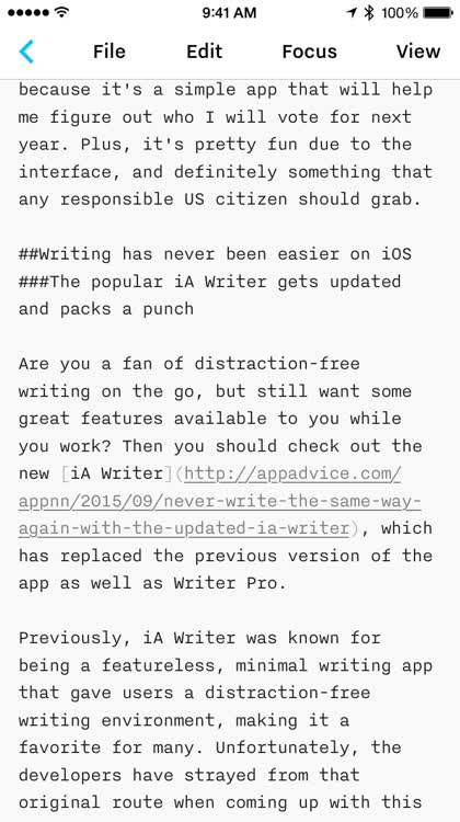
iA Writer went from a simplistic writing app to a powerhouse.
There are many changes that iA Writer brings, especially to the library and preview sections. Now users can sort library by date, extension, or alphabetically, folders can be pinned to the top, files and documents can be renamed with a swipe, previews are now synced to where you were writing, there are three new template previews, swipe navigation between the library, editor, and preview screens, Day and Night modes work across the entire app, and there is export capability to Microsoft Word, HTML, or PDF.
Another big addition to iA Writer is the new configurable keyboard. Just by doing a long tap on a button, it brings up other key options that you can use. Rearranging the order is done by doing a long-press until they begin to jiggle, then just drag-and-drop the buttons to however you want them to be. The app now has a statistics bar at the top that displays word and character counts, and the new find-and-replace tool makes editing long documents easy.
Configure that keyboard

Change up the keyboard to fit your writing flow.
Back when iA Writer was one of the only minimal writing apps on the store, I was a huge fan of it. But over time I discovered other options as they came along, and iA Writer kind of fell by the wayside for me. Personally, I don’t think I’ll be replacing Editorial on iOS with the new iA Writer, but I can see this app being useful for many writers who want a simple but powerful app and don’t need other extras like workflows and automation. However, like Paper, iA Writer has wandered off from the original concept, which is a bit upsetting for some people out there. But if you’ve always wished that iA Writer could pack some powerful new features, then this is a good time to give the app a try.
iA Writer is a universal download on the App Store for $9.99. It replaces the old version of iA Writer and Writer Pro.
Our Rating
To learn more about iA Writer's update, check our original post.

A fast and streamlined way to get the right input
Do you use a lot of different cloud services and apps to get things done? Then you may know the annoying feeling of having to switch between multiple apps frequently, right? If so, then you should take a look at the recently released Input – The cloud console by Matt Healy.


Input is like Terminal on iOS for your cloud services
Input is a minimalistic looking app, which is good because it fits in with the simple nature and concept — a central hub for capturing information and taking action. The app has a lot of white with differently colored text to indicate actions and whether they were successful or not, as well as giving users direction on what they can type in. This is an app that is designed for everyone, including average users, but the power-user can get just as much out of it too.
Input is your central hub

Input what you need and get on with your life.
The only negative to the app is the fact that it requires a Google account login. Hopefully the developer changes his mind about this in the future, since not everyone uses Google or would prefer to not use their credentials in everything. Once you are logged in, though, you can start logging in to your other services, such as Dropbox, Evernote, Slack, Todoist, Wunderlist, OmniFocus, Twitter, and more. These services may have additional settings that you can configure when it is set up, which can streamline the entire process when you input your text commands.
By default, Input launches on the main screen each time, with your cursor in the input field, ready to type. A popover menu appears that gives you prefixes for all of the services that you added, so you can select the one you want or just start typing and have the results filter themselves out. When a service is picked, you’ll see blue sections in the text field — these indicate separate sections that are associated with that service, such as Note Name and Note Text for a new Evernote note. Having this highlight syntax makes it easy to understand what kind of information you should be feeding to the service.
Customize your services

Each service can be tweaked for an overall better experience.
I’ve been using Input for a few weeks, and it’s a great addition to my productivity toolkit. It is fast and easy to use, so anyone can get use out of Input. The limited natural language support that the app can understand is enough to quickly capture something for your calendar, for example, before it escapes you. There are still some improvements that can be made, but Input is fairly solid for what it is right now.
Input is on the App Store as a universal app for free, and you can purchase three more connections at a time for $1.99.
Our Rating
For a more in-depth look at Input, check my review.

Editor's Choice
Launch Center Pro

Our top pick this week goes to Launch Center Pro's big update.
While there were many big updates and cool new apps that came out in the past week, the top pick for me this time is Launch Center Pro, naturally.
I’ve been an avid supporter of Launch Center Pro ever since it first came out many years ago (pre-Pro version), because it was a fast and easy way to get to my favorite apps without having to flip through pages of apps or type for what I want. Launch Center Pro has been in my iPhone and iPad dock for years now, and I cannot even imagine using my devices without it now. Ever since Apple brought the Notification Center and Today widgets into the picture, I have been longing for a way to get quick access to apps and actions with just a swipe on the lock screen, rather than having to launch the app itself. While other apps were able to do it when iOS 8 came out, Launch Center Pro kept getting rejected, but the day has finally come.
Since I’ve been using Launch Center Pro already, I do not need to come up with new actions in the app, and I can just add some favorites from what I have already into the Today widget. Plus, with Launch Center Pro’s Dropbox backup feature, I know I can restore my shortcuts easily.
I use Launch Center Pro dozens of times a day, and my muscle memory is trained well with the placements and positions of my shortcuts. Because of this, Launch Center Pro will always be faster than even searching for an app via Apple’s Spotlight on iOS. Having the backups, over 100k supported apps, iOS 9 support, and an awesome, customizable Today widget are just icing on the cake.
If you haven’t checked it out already, go get Launch Center Pro now. You won’t regret it. For a guide on how to use Launch Center Pro, I recommend checking out Sandy Stachowiak’s article.


