
Now you can annotate photos and create text notes in Paper

Paper - Notes, Photo Annotation, and Sketches by FiftyThree (Free) by FiftyThree, Inc. received a large update last week that finally brought one of the best sketching apps to the iPhone. But the update didn’t just bring Paper to the iPhone, it brought a slew of new features and several changes, so was it worth it?
When Paper originally debuted in 2012, I loved having the app on my iPad 3. I don’t have any artistic talent, but it was still fun to come up with small doodles or write out messy notes for fun whenever I was bored. I loved Paper’s interface with the notebooks and always-accessible drawing tools, so I was eager to give the app a try on the iPhone when the update hit.

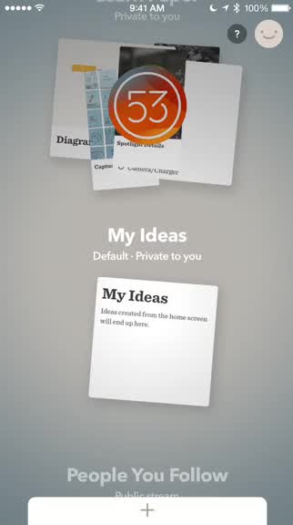
If you were in love with the notebooks that made Paper unique, then I’m afraid to say that these are no more. Instead, Paper has now gone with “Spaces” and piles of paper sheets instead of the clean and neat-looking notebooks that everyone loved. While I’m not completely heartbroken, since there are still some smooth and fluid animations as you transition from space-to-space, this does feel a bit more cluttered and messy than the previous approach. Perhaps time will change things, but the notebooks were a big deal for many. The Spaces can still be “customized” by choosing different covers, which are now just circles with a color, design, icon, or photo laying on top of the sheets of paper. The typography that the developers have used for the general design of the app (sans serif), as well as the notes (serif) is beautiful and legible, which is nice. Navigating through the app is still fairly intuitive too, since it makes use of the swiping and pinching gestures that have been used by pretty much everyone at this point.
Another big change with Paper is the fact that you now have to create an account in order to use it. You can sign up by email, and the process is quick and painless, though it is another login to remember. The benefit of making an account is so that all of your sketches and notes will be synced and accessible from any device that has Paper on it. Personally, I like having an account so my data is not lost, but I know others may disagree.
When you start with Paper, there will be two default spaces: Learn Paper and My Ideas. Any note that is created from the home screen of the app will show up in My Ideas by default. You can also “follow” other Paper users and see their public sketches and notes in the “People You Follow” space. To make a new space, scroll all the way to the top and tap on the “Create A Space” button. Doing this will make a new one called “Space,” and you can customize the details by tapping on the name.
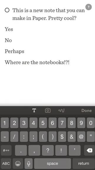
To add a new sketch in a space (or from the home screen), just tap on the button towards the bottom. Now Paper will default to text notes, though you can change the mode by tapping on the camera or draw buttons adjacent to the text.

When dealing with text, Paper has the new swipe-to-style feature that turns your note into a to-do or bulleted list with a right swipe, or into a header with a left swipe. Unfortunately, you can’t change the font or use rich formatting, which would have been nice to have considering the fact that you can make lists in the app now.
If you want to throw in an image in a Paper note, just tap on the Camera button and you can choose to do a new capture or import from the Photo Library. Images can be resized through the pinch gesture, and you can use the “Spotlight” feature, which can be done by tapping or drawing over an area, to highlight it on the sheet. You can also use the drawing tools over an image, which seems to have led to the controversy of people tracing over photos. However, if you look at the bigger picture, this means that people are able to annotate and make notes on images too, which is much more useful in my opinion.
As you begin to accumulate notes and sketches, you can tap on them to view a larger thumbnail, and then tap on the “Share” button to make it public and viewable to followers, or share it via the standard iOS Share Sheet. The ellipses button gives options to delete, duplicate, or move the note to a different space, and the last button lets you rotate the sheet as long as it is a sketch or image. When viewing an entire space, you have a few choices for sharing. A whole space can be shared as a PDF, presentation (Keynote or Powerpoint), or sent as images.
I’ve been using Paper for iPhone a bit over the past few days, and so far I find it useful. I doubt I’ll be replacing Todoist with Paper, but I like using the app for making quick lists of things I need to get at the store, or annotating photos for future reference. I wish that they kept the notebooks, though, because the stacks of paper sheets just doesn’t feel as organized, plus it was fun to flip through pages. Maybe one day they’ll consider bringing that back, but even so, I’ll keep Paper around on my phone for keeping my lists and ideas together in one place.
Paper is available on the App Store as a universal download for free.
Mentioned apps


