Apple Updates iBooks, iTunes U With An iOS 7 Look And Feel
by Brent Dirks
November 14, 2013
Apple has just updated two more of its apps, iBooks and iTunes U, to match the flatter and simpler design of iOS 7.
First up, iBooks was in dire need of a makeover, and Apple definitely delivers in version 3.2.
The skeuomorphic design and beyond tacky wood paneling have been dropped for a sleek background. The new icon is much like Pages and features orange gradients with an open book.
Along with a very similar icon that features a graduation cap, iTunes U also ditches its previous look. Courses are now displayed in a virtual bookshelf collection much like in iBooks.
Both iBooks and iTunes U are universal apps designed for the iPhone/iPod touch and iPad/iPad mini. They can be downloaded now in the App Store for free.
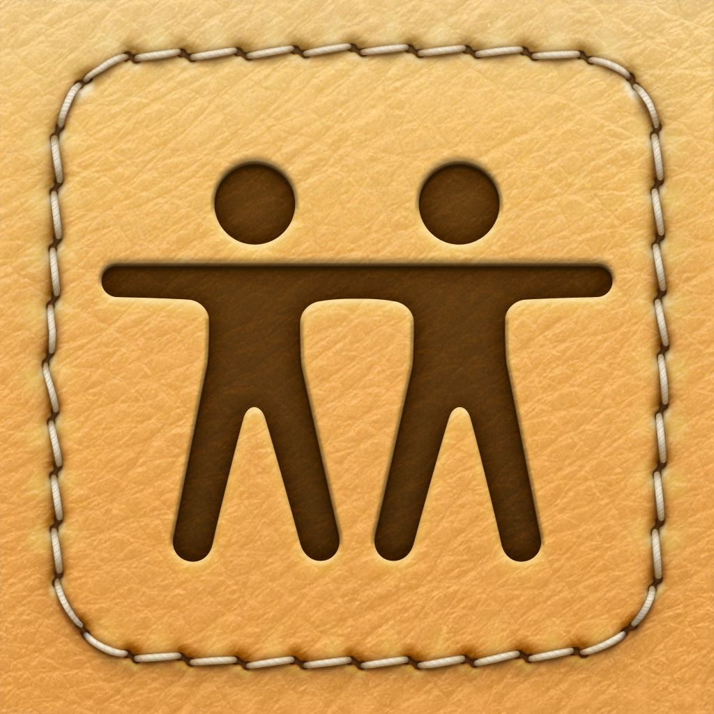
With these two updates, almost every Apple app has received a new look for iOS 7. The only major holdout looks to be Find My Friends, which still features the same stitched leather design.
For other app news today, see: Long-Awaited Robot Combat Cover Shooter Sequel Epoch.2 Finally Comes Out In The Open, Moves 2.0 Features iOS 7 Design, M7 Integration And New Battery Saving Mode, and Pulse Rebrands As LinkedIn Pulse, Unsurprisingly Features Deep LinkedIn Integration.


