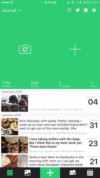

Day One 2 brings an even more streamlined journaling experience

Day One 2 Journal + Notes ($4.99) by Bloom Built, LLC is a huge update to everyone’s favorite journaling app. With Day One 2, everything has been rebuilt from the ground up, essentially, giving users a much more streamlined journaling experience. If you have been using the original Day One, then this is a paid update that is definitely worth checking out.
As someone who has tried to keep a paper journal for many years as we entered a digital age, the moment I found Day One was a lifesaver. This one app has made it possible for me to keep a daily journal for the past several years now, complete with photos to accompany my memories, both good and bad. It has also been a way that I keep track of movies and shows I’ve seen, coffees and beers I’ve tried, and many other small things. Day One has been one of those must-have apps of mine for a while now, and it has earned its spot on my home screen. When I heard that Day One 2 was in development, I was excited to see what the future of the app held, and I had to get my hands on it. I’ve been beta testing Day One 2 for the past several months, and it has improved my overall journaling on my iPhone and Mac.
Since we’ve covered Day One extensively several times before, today I’m going to dive in to just the new features of Day One 2 in this review.

Multiple Photos
One of the biggest caveats of the original Day One, to me at least, was the fact that you were limited to just one image per journal entry. This meant that you had to pick the best image that represented your day or memory, and sometimes this was just downright impossible. So for things like that, I ended up creating multiple entries for a single day just so I can include several photos that I took for an event or just some memorable opportunities. That is no longer the case with Day One 2.
In Day One 2, there is now support for up to 10 images per journal entry. It defaults to your Camera Roll, though you can go back and select a different album if need be. Just tap on the images that you want to add, and you’ll see at the top how many more images you have left to select for the entry.
Once you are done selecting your photos, just tap on “Done” and then a new entry is generated with all of those photos. What I like about this in particular is the fact that the app places all of the photos as inline images, and you can tap on the caption button on each image to start writing underneath it, creating a little photo story. There are also buttons to expand the image into a larger size if you want to see it while writing, or you can trash individual images if you change your mind. As usual, Day One will ask you if you want to use the date, time, and location activity associated with the EXIF data on the photos, though this won’t work if you are adding multiple images from multiple locations and times, of course.
I’ve been wanting multiple photo support for years, and I’m extremely pleased to see that it is finally supported in Day One 2. Personally, this alone is worth the cost of the app for me.
Multiple Journals
Now in Day One 2, users can have up to 10 different journals in the app, with the ability to customize the name and color associated with each one. This is a feature that I know others have requested for some time, but I didn’t think I had much of a need for it. I’ve tried making some other journals for other purposes, and while it helps with organization, it may not be something I use too frequently, though I’m trying to change that.
Your primary journal will now be named “Journal,” and you can tap on the text button in the top left to bring up a menu on the screen. To add a new journal, just tap on the creation button, then give it a name and choose a color. Unfortunately, the colors are pretty limited with just 12 to choose from, and you can’t customize your own color. Maybe this will change in the future, but at least there are enough colors so that you can give all of your journals something different for easy recognition. The selected color will be reflected throughout the app, as long as that journal is still active.
Once you have multiple journals set up, you can see each of them when you tap on the button in the top left corner, as well as an indicator of how many entries and photos are in each one. If you view the “All Entries” option, you’ll see every entry from all journals organized in chronological order, and colored text labels that indicate which journal they belong to.
Multiple journals wasn’t something I needed, but I can see how they can be useful. Now you can have a journal for your personal diary, road trips, work meeting notes, or whatever else you need to keep track of. It’s a nice feature that has been a long time coming.
Day One Sync 2.0
With Day One 2, the developers have made a conscious decision to remove both iCloud and Dropbox syncing, and just go with their own native in-house syncing solution, aptly named Day One Sync. This was introduced a while back in the original Day One, and while I have not had issues with the service (free for all users), I think removing the option of iCloud and Dropbox is a bit much, especially considering the fact that their service can experience outages (there was one last night).
I’ve been using Day One Sync ever since they first introduced it, so I’m pretty satisfied, considering how fast the syncing between devices has been for me. Others are not so happy with it, which is understandable. But for now, aside from occasional hiccups (what cloud service doesn’t experience this every now and then), I’m happy with it.
Map View
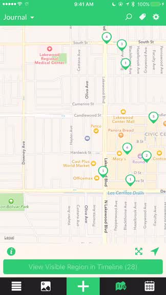
While the original Day One for Mac had a map view, it was strangely absent from the iOS version. I loved the map view as well, since I like seeing where I’ve been and where I’ve logged in my journal.
Now, Day One 2 has a new map view on iOS, which you can access with the map button in the bottom tab bar. It will automatically zoom in to where you are right now, and you can see how many entries you have made in the region. Panning the map around with your finger will load up entry markers as you go, and you can even view the visible region in the timeline by tapping on the button underneath the map. Using the pinching gesture lets you zoom in or out, giving you an even broader scope of where you have logged entries.
As a fan of the map view, I’m glad to see that it has been implemented smoothly on iOS.

Timeline Filters and Entry Management
As you view your timeline, you can now tap on the tag button in the top right to access different filters for your journals. You can see starred entries, years, published, activity, music, and all of your tags. You can view multiple filters at once, which is nice if you are looking for something specific, since it narrows your choices down.
Whether you have the filters on or not, if you tap on the checkmark in the top right corner, you’ll go into the entry management mode. This allows you to select multiple entries and then batch delete, add tags, or move them to a different journal. Unfortunately, there is no no way to delete tags at the moment, so you’re out of luck if you’re looking for a way to do that.
3D Touch
If you have an iPhone 6s or 6s Plus, then you are probably accustomed to 3D Touch in a lot of apps. Day One 2 is no exception, and it has included full support for 3D Touch.
Now, if you perform a 3D Touch on an entry in the timeline, you’ll see a brief preview of the entry, and if you pull the entry up a bit, there are options for sharing, starring, opening in the map view, or deleting it. You can also 3D Touch the photos view to see the entry associated with it.
Other new features and changes
While I’ve covered all of the big changes in Day One 2, there are a few smaller things that the developers have added. Now you can create your own custom reminders, there is timezone support (great if you’re a frequent traveler), and local, exportable backups. There is also an improved Apple Watch app if you like to quickly add checkins from your wrist.
As I mentioned, there is no longer support for iCloud and Dropbox sync, which is a shame. If you want to use Day One 2, you must use Day One Sync, which is fast and pretty reliable, though your data won’t be encrypted. They have also removed the hashtag support from Classic, and Publish is absent at the moment, but will be coming back in the future.
Wrap-Up
Overall, I’m pretty satisfied with Day One 2. This huge update has brought my much-wanted feature of multiple photos per entry, and having multiple journals is something that I like having, though I’ll need to get accustomed to it. The Map View is awesome since it gives me a great overview of where I’ve been and what I’ve seen or experienced, and I love having it on iOS now. The colors for journals is another favorite, because I’ll admit — I was getting a bit tired of the light blue all the time.
While it is a pretty solid upgrade for me, there are still some flaws with it, which I’ve mentioned multiple times. Lack of iCloud and Dropbox sync is a big drawback for those who rely on that syncing method, and not being able to delete tags is a bit annoying. I also hope Publish will be making a comeback sooner rather than later, as I liked to use the platform for sharing my home screens each month.
Still, I recommend giving Day One 2 a try if you’re a fan of Day One Classic and have been waiting for big features like multiple photo and journal support. The design of the app also feels even more streamlined to me, and there are plenty of other additions that make the upgrade worth the price to me.
You can get Day One 2 on the App Store as a universal download for $4.99. The Mac version is available for $19.99. Both versions are 50 percent off for one week only, and will return to regular price after the introductory launch period.
Mentioned apps


