
Get the full story in context with Timeline, a unique approach to the news

Timeline - News in Context (Free) by Timeline.com, Inc. is a gorgeous new way to look at the news in a context that’s easy to understand. If you’re a news junkie, then this is definitely an app that’s worth checking out. It’s similar to other apps like Circa News and Flipboard.
I went to school for journalism and I also check the news every day — I think I’m what you would consider a news junkie, as that’s pretty much all I read on the web. I have subscribed to many news sites in RSS, get news from Facebook and Twitter, and make sure I’m on top of everything with some news apps on my phone. However, even though I’m set in my ways for getting the news, I always love checking out whatever is new in the App Store, and Timeline caught my eye this weekend.

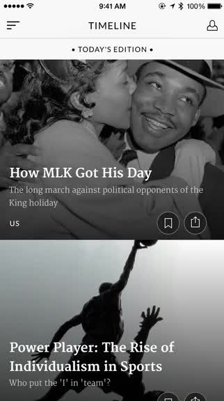
The interface for Timeline is beautiful and engaging. The app displays stories in the daily and weekly editions in a simple list layout, complete with header images on the subject at hand. Each section is divided up neatly so you can easily see what segment you’re in, and as you scroll, the images in the timeline have a splendid parallax effect that melts into the next or previous story’s headline and summary. Timeline makes use of natural swiping gestures for navigation too, so everything feels intuitive from the get-go.
On the first launch of Timeline, you’ll be greeted with a brief introduction that shows you the basics of the app. It’s easy enough to understand, though, and not really necessary, especially if you’ve used news apps like this before. Timeline’s unique feature is that it puts the top stories of the day in full context for the reader, from past to present, so you don’t miss a thing when reading. With an understanding of the past, you can grasp why the story is news today. This is all done with a full editorial team, so all of the stories are original and meaningful, something that is always nice to see in a news app.
To get the most out of Timeline, you will want to make an account so you can save stories for reading later. This can be done using your Facebook or Twitter account information, or you can sign up via email. It’s not necessary, though, and only if you want to save some articles that you can’t read right now. As the day goes on, Timeline gets new editions of stories, and you can also get a push notification when there’s more content to read.
By default, Timeline opens into the Front Page section, which displays the top stories of the day and week. If you swipe from the left edge of the screen or tap on the button in the top left, you reveal the side panel navigation menu. This is where you can jump to specific sections that interest you, such as Technology, World, Sports, or Science & Environment. When you select one, Timeline shows you the top stories from that section as curated and edited by the staff.

When you find something interesting, just tap on the story to read it. Timeline expands the image into a full-blown cover, so it almost feels like a digital magazine that you’re about to read. As you scroll down, you’ll first see a time range that shows how long the story is relevant, and then The Brief section, which is like a synopsis. Then, you can continue to scroll down and read each section of the timeline in order, or collapse the story into the Timeline View, which can be thought of as a table of contents. You’ll see the year or time period for each section, and quickly jump to it with a single tap. As you read, a line in the left margin shows your progress for the timeline of the story. Images can be tapped on to view in a full screen mode with the caption. To go back to the timeline view, just tap on the button in the bottom right.
Each story can be shared via the native iOS Share Sheet, so you can share the story with others who may find it interesting or send it off to other apps. However, be warned — due to the formatting of Timeline stories, it may not save correctly to read-it-later services like Instapaper or Pocket.
I mentioned earlier that you can create an account to use with Timeline. This is for bookmarking stories in the app that you want to read later on, kind of like an in-house read-it-later service. To save something, just tap on the bookmark icon, and it will appear in your profile page, which is accessed by tapping on the button in the top right corner of the main timeline view or swiping from the right edge. The app also saves a reading history of what stories you have read or looked at, which is nice if you ever want to go back to something.
As a news junkie myself, I’m pretty impressed with what Timeline offers in the app. The timeline views are a unique way to approach the news, and this helps out a lot when you’re reading about something you may not be familiar with otherwise. Having an entire history of a subject puts things into perspective and context, which is something that no other news app seems to do, and as a result, nothing of importance is lost on the reader. Plus, it helps that the app is stunningly elegant with the timeline views and header images. I just wish that there was a way to save something properly into a read-it-later service I’m already using, but I suppose the built-in bookmarking solution is not bad.
I recommend checking out Timeline yourself if you haven’t already and are a big news junkie. This is a brilliant way of seeing the news that makes you wonder why it wasn’t done before. You can get Timeline – News in Context on the iPhone App Store for free.
Mentioned apps


