Scratch Looks Like A Beautiful Alternative To Drafts, But Is It Better?

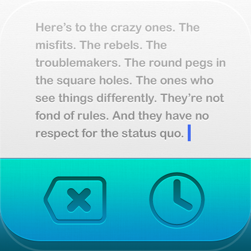
Scratch — Your Quick-Input Notepad ($2.99) by Karbon is quite possibly the best competition for Drafts, which is one of my other favorite apps. Scratch, like Drafts, is a quick note-taking app that makes it incredibly easy to jot down anything at a moment's notice.
Even though I've called Drafts the "Launch Center of Text", Scratch works in a similar manner, though not as comprehensive as Drafts. It does, however, have its own set of fantastic features that I wish Drafts had.
When you launch Scratch, you will be taken right into the editing mode so you can immediately jot down whatever it is you need. However, if you already had a note up, the app will launch back where you left off. While this is nice, I wish that it would open up to a clean slate every time, like in Drafts, and keep the previous note in History upon exit.

Sitting right above the keyboard will be gorgeous two-tone bar that contains three buttons: Delete, History, and Share. Of course, there is more to this bar than what meets the eye — a swipe from left-to-right will reveal the word and character count, as well as the Settings option. Swiping from right-to-left will reveal the Markdown shortcuts that users can use to their advantage. This is especially handy for web writers, since Markdown makes life so much easier.
The first set of shortcut buttons can be customized. To change a button, just do a tap-and-hold on it, and then press the key that you want to change it to. By default, these buttons will have the most-used forms of punctuation, so you won’t need to switch to the secondary keyboard as often.
While the second set of buttons are not customizable, they have many of the commonly used Markdown formats: bold, italics, hyperlinks, block quotes, dividers, headers, and lists. If you use Markdown as much as I do, then you will greatly appreciate having these.
When you “delete” a note, don’t fret! It isn’t gone forever, as it has just moved to the History section. Users are able to see brief summaries of their notes, when it was last modified, and how many words it contained. A swipe on a note will bring up a red delete button.
When you’re done with a note, you can export it in several ways: email, message, tweet, and Dropbox. With the Dropbox option, there are two different things you can do: append the text to an existing Dropbox file, or create a new one. I rather like the option to append the text to an existing file, because it’s a great way to add more information to something you’re already working on.
The app’s settings will have a few options, including the option to insert a newline character when appending to existing text files, and clearing contents after export. Dropbox accounts can be linked and unlinked from here as well.

Currently, I am in love with Scratch’s beautiful interface and design, though I’m not sure it can fully replace Drafts for me at this point in time. I appreciate having the keyboard extension for easier writing, but I am missing all of the personal export options in Drafts, including integration with other third-party apps.
Another thing that bothered me was the fact that there is no way to preview Markdown formatting in the app. I believe having a live preview is a must-have for any app that supports Markdown, so hopefully we’ll see it in the future. Oh, and just like Drafts, there isn’t an iPad version yet either.
I won't be moving Drafts from my dock just yet, but I will definitely be keeping Scratch on my iPhone to see what lies ahead in updates.
Are you currently using Drafts on your iPhone for quickly jotting down notes before they get away? Or are you willing to give Scratch a try?


