AppAdvice App Of The Week For December 10, 2012
Every week, our staff will handpick an app from the past two weeks that we believe is a must-download for your iPhone or iPad. These apps will always be from various categories, but they are chosen because our own staff members love it and have been using them daily. So here are this week’s picks! Enjoy!
Twitterrific 5
Even though most people on our staff love Tweetbot, we couldn’t help but take notice of the rebirth of the one app that started it all for iPhone Twitter apps: Twitterrific. Now on the fifth iteration, Ollie has brought along a brand spankin’ new interface that makes reading your tweets quite a pleasure.
Rebuilt from the pixel up, Twitterrific 5 sports an interface that is similar, yet unfamiliar, from previous versions. And it is a thing of absolute beauty. There is also a pull-to-refresh mechanism now, or as they would say, “Ollie-to-refresh.” This is a beautiful animation that you will want to witness for yourself. Besides the animations (and sounds) used in Twitterrific, you get a clean and fresh interface with customizable appearance settings, including five different fonts (Helvetica, Proxima Nova, Signika, Museo Slab, and Calluna), Light and Dark themes, avatar and text size, line spacing, and even systemwide brightness control.
Twitterrific also uses the Unified Timeline, which will have all of your mentions (even from users you don’t follow) and DMs mixed in to your regular timeline if enabled. Otherwise, you can view everything in the appropriate section with the top navigational menubar. It’s a bit of an odd placement, but Twitterrific makes it work.
Gestures are quite an important feature in the new Twitterrific. First, a full-screen mode can be enabled by doing a two-finger swipe up, which brings the focus on your timeline and eliminates iOS chrome. A swipe to the right on a tweet will enable you to reply to someone, and a swipe to the left will bring up the conversation thread. Tapping on a tweet will reveal several action buttons for replying, retweeting, favoriting, and more (show discussion, translate, email, and retweet with comment).
Rather than be an app designed for power-users, Twitterrific is more for the casual user. That’s why the app is “less is more,” and this is actually a feature of the app. When you compose a tweet, you get space to type out your tweet, attach a location to individual tweets, and attach an image. However, images will be uploaded to pic.twitter.com — there are no other options for image uploading services. Unless you are part of the nerd/geek crowd, this may not be such a big deal.
As a bonus, when you reply to someone, the tweet that you are replying to will show up on the bottom of the compose screen. This is great for those that can’t quite remember everything — it happens to me quite frequently.
Links, usernames, and hashtags are tappable from within the timeline, and Twitterrific supports Instapaper or Pocket for reading links later. You can also just view everything in the fully integrated in-app browser. Syncing your timeline position across multiple devices (Twitterrific 5 is a universal app for your iPhone and iPad) is done through iCloud or Tweet Marker.
While some of us can’t ditch Tweetbot fully for the power-user features, Twitterrific 5 is a great app for the more casual Twitter user. If you are looking for a beautiful way to read your tweets, then make sure to check out Twitterrific 5 on your iPhone and iPad for only $2.99 in the App Store.
And make sure to check out my full review of Twitterrific 5 here.
Honorable Mention
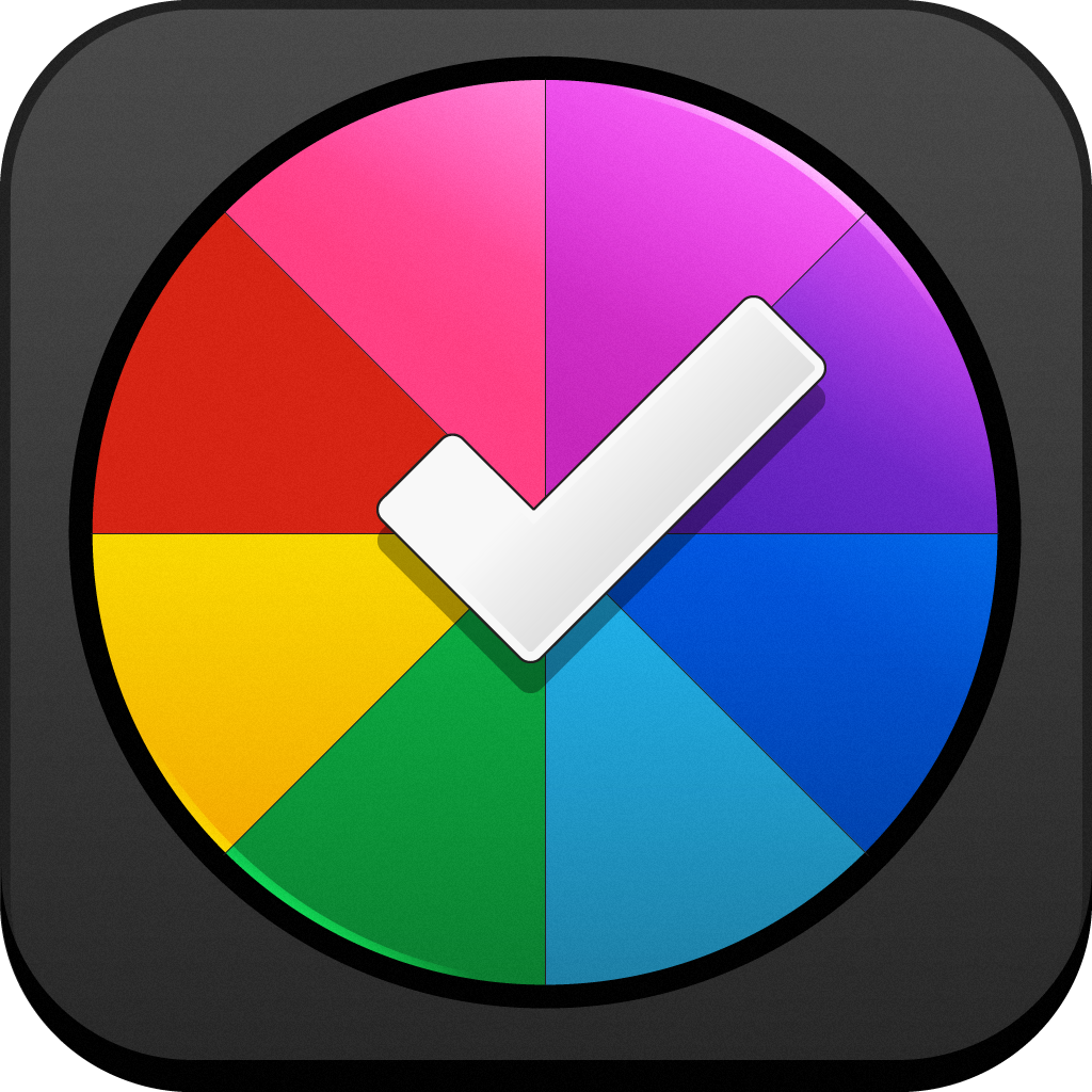
Sooner: to do list & weekly planner
If you’re still in the market for a to-do app that works for you, then you will want to check out Sooner: to do list & weekly planner from SMS Services O.o.o. This is an intuitive and fresh new take on GTD, so it stands apart from other apps like Things and The Hit List.
The first thing you will notice with Sooner is the wheel interface. While it’s a brand new way to look at your tasks, it also makes it incredibly easy to add new events. There are two dials: Categories and Calendar.
With Categories, you are able to add different life areas into the app and color code them for easy recognition. With all of your different sections, they will form slices of the complete pie, and a tear drop spinner is in the center.
To view your categories, just drag the wheel to spin it around. To create new events, you just have to drag and drop the tear drop to where and when you want to add it. Since it is possible to do this with just your thumb, creating new tasks has never been easier. Task priorities are also integrated.
As our own Sean Capelle puts it, the Calendar mode is what really makes the dial interface click. Since the days of the week are on the outer rim, the dial advances through hours. It’s quite easy to get a complete overview of your day, and even your week.
The only negative about the app is the fact that categories and calendar dials don’t work asynchronously with each other. This is also an iPhone-only app, though it makes sense since it is best used with one hand.
If you’re still looking for that perfect to-do app, then this gem is worth checking out. You can get it on your iPhone for $0.99 for a limited time.


