
Streamline is a calendar app that brings a new approach on how you should see your schedule

Streamline - calendar ($3.99) by Serendipi is a new, streamlined approach to your daily calendar. If you are looking for a new calendar that is unlike any that you’ve tried before, then Streamline is worth checking out. It joins the ranks of other fine calendar apps like Fantastical 2, Tempo Smart Calendar, Calendars 5, Horizon Calendar, and more.
When it comes to iOS calendars, while there are many fine options to consider out there, I’ve stuck with my personal favorite, Fantastical 2, for several years now. To me, it has the best design for seeing my daily, weekly, and even monthly schedule, and I love the natural language input for creating new reminders and events. However, just because I’ve settled on one option doesn’t mean I don’t like to explore other choices out there, so when I saw Streamline hit my inbox, I was definitely intrigued by the unique design and gave it a try for myself.

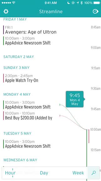
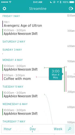
The design of Streamline is truly unlike any other calendar that you’ve used before. Instead of focusing on the traditional calendar views with event blocks, Streamline organizes everything in a timeline view that you can see by the hour, day, or week. The timeline offers much more information from a single glance than the normal calendar views, which is great if you need to see more events quickly. The typeface used in Streamline is easy to read, though the size may be a bit small for some. The white and teal colors are easy on the eyes as well, while providing some nice contrast. Streamline opts for streamlining your calendar in a simple way, and does not offer many options for customization, unfortunately.
When you launch Streamline, you’ll have to grant it access to your native iOS calendars, as that is the source that Streamline fetches data from. Once permission is granted, you can toggle which calendars to display by tapping on the cog in the upper left corner, then picking the ones you want to hide or show (highlighted). On the main view, you’ll have the timeline, which can be shown three ways: Hour, Day, and Week — just select the one you want from the bottom toolbar. The toolbar can be collapsed or expanded with a tap of the magnifying glass button.
In Hour, the timeline on the right breaks down the day in 15 minute intervals, while Day shows every hour. The Week view will show up to eight days at a time (on my iPhone 6, may be more on the 6 Plus), and all of your scheduled events appear on the left-hand side. Events include the day they happen on, the start and end time, and there is a colored line to indicate which calendar the appointment belongs to, which is helpful if you have multiple calendars going on. Streamline will also have curved lines appear connecting an event to a specific time or day in all of the views, so it’s easy to see how your days are even when you are zoomed in (pinching gesture) on the timeline. To jump back to today, just tap on the button in the top right corner.

Creating a new event in Streamline is easy too. While you don’t see the normal “New Event” button like most calendars, adding a new event is as easy as it can be. The teal bubble that can “scrub” the timeline is actually a button, and all you have to do is drag it to a specific time frame and release your finger to bring up the Event Creation screen. From here, you just give the event a title, location, choose your calendar, toggle a single or multiple reminder alerts, fine tune the meeting duration, select a recurrence if needed, and add any notes you may need.
Unfortunately, if you rely on the ability to invite others to an event, you’ll see that Streamline lacks that. I also noticed that it does not have maps for locations when you are viewing event details, and there is also no search functionality. On top of it all, there are no options for customizing the app for things like default duration, reminder for all events, calendar, and more. Streamline has reduced the calendar into something simple, and took away a lot of the custom options that most of us are used to. Because of that, I don’t think I can switch from Fantastical 2 to Streamline.
Streamline is just that — a sleek calendar experience for those who don’t need the extra stuff. I like the timeline design, and how you can zoom in and out of your schedule to quickly see what your day or week is like, but honestly, it’s missing a lot of the power features and options that I rely on daily.
If you don’t need a lot of options or features, but just want to see the most of your schedule in a single glance, then Streamline could be for you. But for others who want something more, then I’d recommend sticking with what you’re already using.
Streamline – calendar can be found on the iPhone App Store for $3.99.
Mentioned apps


