Become More Efficient With the New Things 3 from Cultured Code
If you follow the productivity scene at all on Mac and iOS, then you should be familiar with Things by Cultured Code, which has been out since 2007 and is well-known for it’s simplicity compared to other task managers. Over the years, Things has gone through two major iterations, but this one is the biggest and most powerful version yet.
I consider myself to be a productivity nut in most cases, and I’ve tried pretty much every task manager under the sun on iOS and even on my Mac. Though I tried using Things very early on, I ended up sticking with more complex apps like OmniFocus and 2Do, along with Todoist for a while, mostly because Things did not have all of the features that I needed at the time, specifically due times. But now that Things 3 from Cultured Code has arrived, I think I found my new primary task manager, and honestly, that’s not an easy feat after I’ve been comfortable with my current system (2Do) for the past year or so.
An All New Design


If you’ve been a long-time user of Things, you will remember that the app has always had a rather simple and clean interface that did well at the time. It was simple, sure, but it certainly wasn’t seamless and still felt like a clunky task manager, and you couldn’t tell what your overall progress was on a project. That all changes with Things 3.
The design in Things 3 from Cultured Code has been rebuilt from the ground up to provide users with a more simple interface design that feels seamless and natural to use. The developers made the UI in Things 3 more “invisible” so that it never interferes with the focus on the task content of each user, while also adding rich new features and functionality that make your life easier.
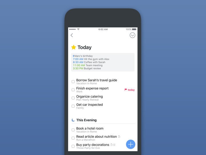
Things 3 Today view on iPhone
Previously, to-dos always just looked like that — a task item in a cell area, along with some tags and a due date. But now, a to-do item just appears as basic text, that is, until you open them. When a task is opened, it works like a piece of paper, empty, and ready for your thoughts. You can add as little or as much detail as you like for each task, and also pick a due date and time, throw in some tags, add a checklist, or include a deadline, but all of these items are tucked away until you actually need them. The developers made this “magic paper” so that each task item adapts to your needs, and not the other way around, so it doesn’t feel like a form that you must fill out each time you need to add a new task in. This is especially true when it comes to using the new checklists feature.
I’ve always been a sucker for fantastic design, and while I always thought the old Things looked pretty, it didn’t have the features that I needed. However, Things 3 has amazing an amazing design and aesthetic, and a ton of powerful new features that tie it all together. It’s hard for me to resist when something looks this good yet still functions properly.
Not Just a New Look, But a New Feel Too


As you’d guess, a new design to an app means a brand new feel when it comes to interactions, and that’s just what Things 3 from Cultured Code brings to the table, especially in the iOS versions.
Now, to-dos are all treated as objects, even though they just look like plain text at first so you can focus on the content. But when you interact with a to-do, the boundaries around them materialize and give a clear sense of form to the user when they drag-and-drop to reorder a list, swipe to bring up contextual menus, tap to expand, or even just marking things as complete. Honestly, I find myself frequently adding things to Things 3 throughout the day because I love interacting with everything — it certainly brings a smile to my face, as silly as that sounds.
One of my biggest gripes with Things before was the fact that you couldn’t really schedule to-dos aside from a day, so you couldn’t set a reminder time, a deadline, or even give it a general sense of time as to when it should be done by. But this changes in Things 3, and it’s one of the biggest reasons why I can use this as my primary task manager. Now, you can schedule tasks by swiping to the right, and there’s even a beautiful new custom “When” picker that includes convenient access to options like Today, This Evening, or Someday, and there’s also a condensed view of the next few weeks that you can pick from. If a reminder needs to be set, it can be done from the When picker as well.

Pull the screen down to access the Quick Find feature
Things 3 from Cultured Code also has app-wide search, and this can be accessed at any time just by pulling the screen all the way down. Just type what you are looking for and results appear instantly from your to-dos, lists, tags, and what-have-you. Projects also have a progress indicator on them so you can see just how much work still needs to be done in a single glance, and there’s even a subtle animation as you complete tasks. For those of you with an iPhone 7 or 7 Plus, there is full support for haptic feedback, so the app feels responsive as you use it.
With my other task managers, I never felt that it was fun to use them like it is with Things 3. Sure, they worked, but they never had any personality or fun to it. With Things 3, the feel of the app coming alive as you use it pulls me in, and gives me even more reason to use it and be productive throughout the day. It’s amazing what a good design can do.
One of the nicest surprises though, is the fact that Things 3 now supports natural language input in the “When” picker. So you can type things like “Tomorrow at 5 pm,” “in fou(r days),” “November 14,” and Things 3 will automatically know what you’re talking about, no questions asked.
The Magic Plus Button
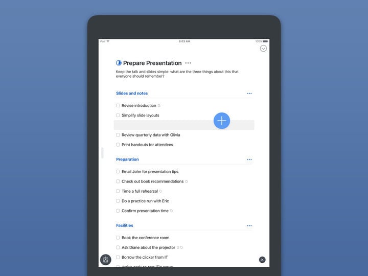
The Magic Plus Button
One of the most important new things of Things 3 from Cultured Code is the Magic Plus Button, and this goes along with the new feel of the app. With other task apps, you usually tap a button, a sheet comes up, you type the title of the task, add some other details, hit save, and the to-do is added to the list, but not where you wanted it to be, so you may have to reorder the list. The Magic Plus button solves this problem.
The Magic Plus button resides in the bottom right corner and floats on top of the interface, which appears to be nothing out of the ordinary. But the real magic behind this button is the fact that it was designed to move. You can drag it into a list on the main screen and it lets you create a new to-do in that specific list that you moved it to. Or you can drag it upwards to a source list to create a new project. Or if you’re in a project and drag it all the way to the left edge of the screen, you’ll be able to insert a new heading (more on that in a bit). Or drag the Magic Plus button to the lower-left corner of the screen to quickly add a new task in the Inbox.
This Magic Plus button is only on the iOS versions of Things 3, but it’s absolutely delightful to use and has made it super fast and easy to create new tasks or projects from pretty much anywhere. I love dragging it around just to see the animation, and it’s fairly intelligent and accurate when dropping it into a specific area. I don’t usually like to add more things to my daily tasks, but the Magic Plus button makes it downright fun.
Find Structure and Balance with Headings and Checklists

Organize your tasks better with headings for complicated projects
For the most part, when I use a task manager, I usually just create “projects” that are merely lists, and then add tasks to it as needed. Normally, I don’t have too many items in a list, but sometimes actual projects can be larger than a few to-dos. Fortunately, Things 3 understands this well and has made it super easy to organize and give your task lists even more structure while retaining a simple and clean interface.
Headings is a new feature in Things 3 and they serve as milestones or can split up your to-dos into different categories. For example, in my “AppAdvice” project, I’ve created a heading for “Software Reviews“ and another for “Accessory Reviews” to keep things organized and separated. And if you have a to-do that requires multiple steps or tasks, just tap on the “Checklist” button and start throwing in all of those sub-tasks. It may not be needed all of the time, but it certainly helps in getting you to stay on track with bigger items.
Plan Your Day and Week

The Things 3 Today view on the iPhone
Along with keeping all of my tasks together in one place, I like to use Google Calendar in Fantastical 2 to keep track of all events and appointments that I have scheduled so I don’t forget about them. While I have a separate app for my calendar, I don’t mind being able to have my schedule and task list together in one place, and thankfully Things 3 from Cultured Code does just that.
If you are using the native iOS or Mac Calendar app in some way, shape, or form, then you can enable your Calendars in the settings for Things 3. Doing so allows you to view your calendars in the Day and Upcoming views, and it’s quite handy to have.
At the beginning of the day, I often like to check my Today view just so I can see what I need to get done today, and today only. With Things 3, this view lets me see my calendar events in a neat agenda timeline at the top, and then the tasks I need to do underneath that. And since the new “When” picker includes a generic evening time block, the Today view includes a “This Evening” section so your entire day is structured. Once the clock hits midnight, the Today view will fetch the next day’s tasks and put them at the top of the list, and they’re marked with a yellow dot so you know that they’re new. There’s also a nice large yellow notification banner that tells you how many new tasks you have for the day.
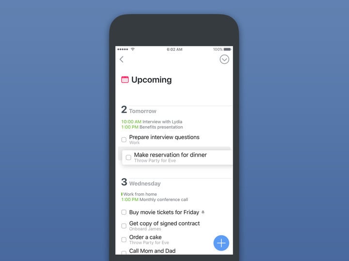
Plan your week with Things 3 Upcoming view
The Upcoming section works similarly to Today, except it displays your agenda for the next few days and weeks. Again, calendar events are shown alongside your tasks, making it easy to plan your time wisely. It’s also easiest to reschedule your tasks in the Upcoming section, because all you need to do is drag-and-drop them to whatever day you prefer.
Time-Based Reminders, Finally

I mentioned this earlier on, but one of the biggest gripes I had with Things before was the fact that you could never add a timed reminder or notification alert to a task. It was this reason alone that kept me away from sticking with Things as my primary task management app, because OmniFocus, Todoist, and 2Do allowed me to schedule my to-dos. Apparently, I was not alone because this is the most-requested feature for Things based on user input. But finally, after 10 years, Things 3 has added it.
To set a time-based reminder, just tap on “Add Reminder” in the “When” popover. Another option, if you don’t feel like clicking around in the time picker, is to just use the natural language parser, so just type in “Tomorrow 8pm” and Things 3 will set up your reminder.
With Things Cloud, the free syncing service that users can enable to keep all data intact across multiple devices, there is a new feature for time-based reminders: Fastlane. This pushes newly set reminders to all other devices instantly, rather than waiting for the next routine push, so everything is up-to-date.
Desktop-Class List Editing on iOS

Sometimes when you want to edit a large number of items in a list in a to-do app on iOS, it gets cumbersome and you may wait until you’re back at your Mac to make those changes. With Things 3, it’s never been more natural or intuitive to edit multiple list items at once.
The Magic Plus button that I talked about earlier is a key player here. It allows users to insert a to-do item at any position in a list. Easy peasy, right?
To select an item, you just have to swipe left on it and then you can act on it with the menu along the bottom of the screen that shows up when there’s at least one selected item. If you need to pick more than one, just keep swiping and then act on them all at once. Another way to select (or deselect) large groups of items at once is to just swipe up or down on the selection circles that appear on the right after one item is selected. You can use the menu to move items with the picker, or just drag-and-drop.
With me, I don’t end up rearranging my tasks too much, so I’m not sure how much use I’ll get out of the list editing features. But if you are the type of person who needs to rearrange a lot, then these interactions and gestures will make your life a lot easier.
Some Awesome New Things for Mac Features
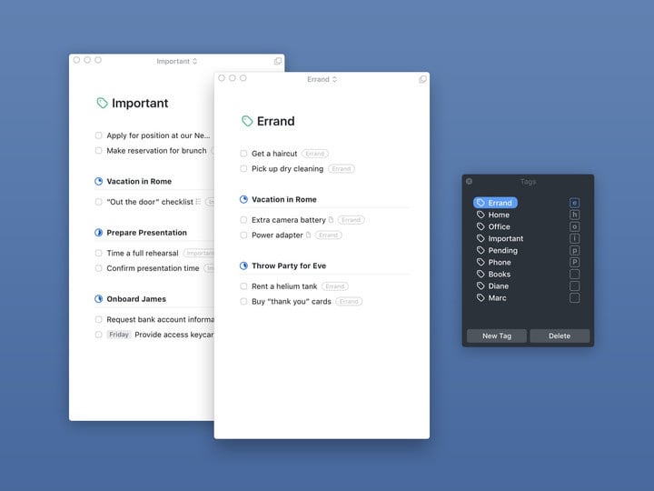
If you prefer to work with Things on your Mac, then you will be pleased to know that there are some wonderful new features that are in this new version that allow you to simplify your workflow.
A new Slim mode has been added, which hides the sidebar so you can focus on your tasks. To enable it, just hit Cmd+/, or just swipe with two fingers. As you’re in Slim mode, just click on the window title to quickly switch to another list, project, or area. And when you need to work on things from multiple lists at once, you can open multiple windows and change the currently selected list for each window. Each of your task windows can be moved to other displays (if you have a multiple display setup) or just other desktop spaces.
And finally, Things 3 for Mac introduces the new Type Travel feature, which is a brand new way to navigate through your lists, tasks, and tags. All you need to do is just start typing while Things 3 is in the foreground, and you’ll get instant results — find the one you need and you’ll be instantly transported to that list or tag. It is completely invisible but responds the moment you start typing, and it can definitely spoil you when it comes to other apps. There are also a bunch of new keyboard shortcuts that will make using Things even faster once you learn to master them.
The Verdict

I’ve been using Things 3 on my iPhone and Mac for the past week, and I think I’ll be replacing 2Do with Things from now on. I am in love with the new design because it looks simple and clean, and “task manager” does not immediately come to mind when I look at it. The interactions (gestures and swipes) are fun, seamless, intuitive, and completely responsive, so using the app feels fun and not a chore. As someone who likes to keep my schedule and tasks organized in one place, I appreciate the new ability to have my calendar events with my to-dos in the Today and Upcoming views, and having time-based reminders after all these years is a godsend. The Magic Plus button is also a clever addition that makes managing your lists and to-dos easier, and it’s a wonder why it was never done before.
I covered the biggest new changes in this review, but there are many more new goodies that are included, such as an updated Apple Watch app, Touch Bar support, Quick Move, a new scrolling date picker on Mac, and much more.
Things 3 from Cultured Code is a fantastic upgrade for existing users, or a great entry point for those who want a powerful and flexible task manager that doesn’t have an over-convoluted interface. Unfortunately, Things 3 is a paid upgrade, so existing users will need to pay for this brand new version.
Things 3 for iPhone/Apple Watch is available on the App Store for $9.99, and the iPad version runs for $19.99. The Mac version will cost $49.99 and is on the Mac App Store. There will be a 20 percent discount on all apps for one week, and this promo ends on May 25. A 14-day trial of the Mac version is available from Cultured Code’s website.