How to get the perfect iPhone home screen: Try this app arrangement theory
The only thing that’s more important to me than my iPhone and the apps I have on it is their arrangement on my home screen – a sad, but very true thing I have to admit. At least I’m not the only one. We have other staff members who are obsessed with their home screens, and they’ve told you all about the apps they use and their home screen preferences.
But I want to focus more on the theoretical aspect of arranging your home screen, and less on the specifics of the apps I use. The way I see it is that I can have a device with a load of great apps on it, but if I can’t find them easily, what’s the point? Anyone who knows me in meatspace – especially those who aren’t tech-obsessed like we are here at AppAdvice – will tell you that I spend too much time and effort caring for this beautiful place within iOS. Since it’s so important to me, I’d like to take some time to share what I think is the ultimate solution to arranging your iPhone’s home screen, and more specifically, how to perfect your first page.
My arrangement theory
With years of experience using different iOS versions and screen sizes, I’ve spent a lot of time decomposing the structure of the home screen in my mind. This may seem trivial when considering that iOS has the most basic type of home screen when compared to practically any other platform, but despite only consisting of a grid of icons, there’s still a lot to think about when arranging your apps. You don’t just throw them anywhere; that’s not how it should work.
When deciding how you’ll arrange your apps, it seems obvious to put whichever apps you use most often on the first page. But if you break that first page into further tiers, that’s when you arrange it for how you use those apps. Especially since the arrival of 4-inch iPhone screens, it’s difficult to focus on all of the apps on a given page at once. By organizing using my arrangement theory, the taller pages become less overwhelming.
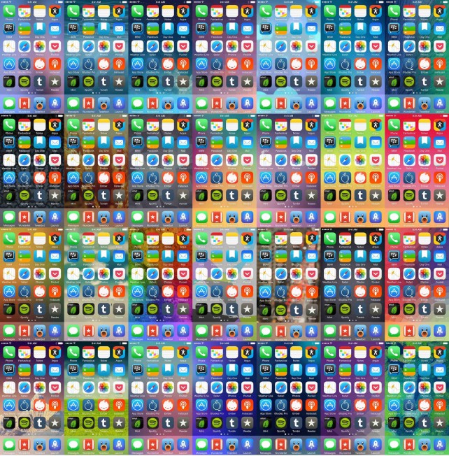
Let’s start with the upper tier. This takes up the first two rows on the screen, and although you might not notice it, it’s often the first thing your eyes focus on after unlocking your iPhone. That’s because this lies directly behind where the clock sits on the lock screen, which, especially with iOS 7, is the only thing to focus on, really. Apps that go in your first tier should be really important ones that you might forget to check since they’ll be the first thing you see when you unlock your phone. Especially if you use Touch ID, the clock will literally fade and be replaced by these icons immediately, so notice how my upper tier includes important apps like Phone, Fantastical, Passbook, and Mail. These are there because I need to have them in front of my eyes all the time, regardless of whether that’s because I can’t miss notifications from them or need to access them quickly.
Next, let’s look further down at the lower tier. This includes the last two rows of your first home screen page, excluding the dock. Here, it’s best to put apps you use often, but won’t necessarily forget about either. On my home screen, I have apps like Reeder for RSS, Instacast for podcasts, and Ember for iOS screenshots – all apps that I use on a daily basis, but won’t forget about either. You’ll also notice that this is where I keep Rdio. Or Spotify. Or Beats Music. I can’t decide. These all need to be on the first page, but not in my immediate focus.
What about the row between the upper and lower tiers? I like to call it the transition row. That’s because it’s best for apps that require more attention than those in the lower tier, but less than those in the upper tier. What you put here should be more up to your interpretation.
Finally, let’s talk about the dock. The dock is the best place to put the apps you use the absolute most often – so often that you’re certain you won’t forget about them. The apps in your dock are those you hit while barely looking, which is perfect since the dock never changes regardless of which page you’re on, and because it sits furthest away from the upper tier. My dock includes Messages, Wunderlist 3, Tweetbot 3, and Launch Center Pro, because I use those apps constantly throughout a typical day and need them to be available pronto.
One more thing: A quick bit about wallpapers
The only thing nearly as important as my home screen’s arrangement is the wallpaper I put behind it. I’m often hesitant to admit it, but I want to be transparent with you guys: I have a bit of a wallpaper fetish. Day in and day out, I constantly change my wallpaper, always searching for the “perfect” one, which I’m kind of afraid might not exist. In case you’re looking for any of the iPhone wallpapers I’ve showcased here, they can all be found on this shared iCloud library that I constantly add to and delete from. I try to give artists credit in the comments, but as you know, it’s often hard to find the original sources for these things. With that said, if you ever post your home screen anywhere online – and I urge you to do so in the comments – be a good Internet citizen and source your wallpaper. By the way, do you guys know of any good wallpapers?
Why bother?
If any of my arrangement theory makes sense to you, you’re probably wondering why one would go to that length of insanity detail-oriented arranging to get their iPhone’s home screen to be “perfect.” If this level of home screen obsessiveness is too much for you to handle, I understand. But at the same time, once you put in the effort to get your first page as perfect as can be, you’ll feel more efficient on your iPhone. Especially once you’re used to it, it’ll feel like you’ve truly personalized your device. Sure, if you’re like me, you’ll make frequent changes or completely tear your first page apart from time to time, but I always find myself going back to following this rule because it works for me.
Regardless of how the first page of your home screen is kept, we’d like to see it. Be sure to add yours in the comments section, using the image icon at the bottom left corner of the DISQUS interface to upload it. You could also include a link.
I’ll start first: you can find my home screens on my homescreen.me profile.
Mentioned apps
