
Readdle's Spark is an innovative new approach to processing your email
Spark - fast and smart email for your iPhone (Free) by Readdle is a fantastic new approach to your email, and it’s one of the best ones at that. We’ve gone through a ton of email apps in the past, but the search for the “perfect” email client is now over. Move over Mailbox and Outlook, because Readdle’s Spark has finally landed.
When email was first introduced, I thought it was one of the coolest things ever. At the time, I didn’t know better, because I was just a teenager when I got my first email address, and I used it as a way to stay in touch with my friends at the time. I never thought that once I got a job that involves email, or once I subscribed to a bunch of newsletters, I’d end up being flooded with messages on a daily basis, eventually making me dread checking my inbox each day. I’ve gone through many email apps on my Macs and iOS devices over the years, including some of the more popular choices like Sparrow, Airmail, Outlook, and Mailbox (sorry, was never much of an Apple Mail person), but none of these made me feel good about going through my email. They didn’t really help me with quickly going through and processing my inbox either. I was about to give up all hope for my email, but then Spark came along.
This one simple little app has changed everything regarding how I deal with email.

The design of Spark is beautiful, as it features a clean, flat design that’s filled with vibrant colors and fluid, bouncy animations. Visually, Spark is one of the best looking email apps I’ve come across, and the design has helped me process my inbox much faster than before, so it’s not just pure aesthetics. I’m happy with the typeface that they’ve chosen since everything is easy to read from a glance, and I found all my messages display properly (wasn’t the case with some other apps). All of the button icons are easily recognizable so you don’t waste much time learning how things work — they just come naturally.
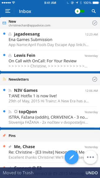
Spark’s unique feature are the “cards” in the Smart Inbox, which help to filter and organize your messages, and the floating buttons in the corner for composing and other widgets mean quick access, especially on the larger screens of the iPhone 6 and 6 Plus. The side panel menu, which is accessed by tapping on the “hamburger” button at the top, provides users with full access to the app’s different sections, as well as any folders and labels that they’ve set up previously. There’s even a lot of choices for personalization in Spark, so you can customize the app to however you’d like.
Spark supports multiple email accounts through Google (Gmail and Google Accounts), Exchange, Yahoo, iCloud, Outlook, and “other.” I’m not sure what else is supported with the other option, but it depends on your provider — chances are it may or may not work. I’ve been using Spark for the past month or so with my four Google emails and things have been working flawlessly.
In addition to email accounts, Readdle threw in another bonus: support for connected services. Users can log into their accounts for these through the Settings view from the side panel menu, and so far they include: Dropbox, Google Drive, Box, OneDrive, Readability, Pocket, Instapaper, Evernote, and OneNote. Don’t worry if you have a personal and work account for any of these services — Spark can support up to two each. Having your accounts connected with Spark means you can pull up any file for attachments in a message or save something directly from a message.
Once everything’s set up, the main view that you’ll probably spend the most time in by default is the unified Smart Inbox. The Smart Inbox features cards that serve as filters for all incoming messages, and this feature alone has saved me many minutes each day when I process my mail. I’ve left my Smart Inbox settings on the default and have found that it works well for my brain. New messages will always be at the top, then emails that had notifications on them, followed by newsletters. These cards show about three message previews in them, and if there are more, you’ll see the “View All (#)” at the bottom of the card. Just tap on this thin bar to expand the card and see all filtered messages. You can mass delete all messages in a card by scrolling to the bottom and then dragging the handle on the left side of the bottom bar all the way to the right.
In addition to the filter cards, you can have Pins (starred) messages in a separate card, which is underneath the previously mentioned cards, as well as the Inbox. I’m particularly fond of the pinned email card, since it means my flagged emails are always within reach — no more digging around.
To read a message, just tap on it in the list and Spark downloads all the necessary bits quickly, and nothing is skewered in the result. Threaded conversations are strung together nicely, so nothing gets lost in translation. If a message is particularly long, Spark only shows a portion of it, but you can view the full message with just a tap once you scroll to the bottom. At the bottom of the message view are buttons for marking as “unseen,” replying, archive/delete, forwarding, and “more.” The more button has options for printing, saving, moving to a folder, archive and deleting, view details, mark as spam, and save as PDF. At the top of the message are buttons for pinning and setting a snooze.

Additionally, you can quickly take action on emails from the message list as well by swiping on an individual message. A swipe to the right on a message brings up archive, with a longer swipe for deleting. Swiping to the left will pin, and a longer left swipe is for snoozing, like you would in Mailbox. While I find the Smart Inbox to be one of the most useful features of Spark, if it’s not your thing, or you just need the regular unified inbox for the time being, just tap on the toggle at the top — it turns the Smart Inbox off temporarily.
Since I deal with a ton of email every day, I will admit that things end up lost in my inbox on a regular basis. I usually remember if I got something or not, but if I need to check it again, I prefer searching for it instead of scrolling through a long list of messages. Fortunately, Spark has that covered too. To search for something specific, just tap on the magnifying glass in the corner and type in your keywords or email addresses. Spark gives you results in real-time and have been fairly accurate for me. Once the search is initiated, you can also choose to filter results by all or specific email accounts. If you search for something often, it can be saved for quick use in the future.
To compose a new message, just give that floating blue “+” button in the bottom corner a tap. When composing a message, you can quickly switch which email you’re sending from, add attachments from connected services, and swipe through your signatures to make sure that it’s appropriate for the situation.
These days, it’s all about the quick replies it seems, and Spark handles that beautifully. When you are viewing a non-HTML message, there are three options at the bottom of the thread: Like, Thanks, and Smile. Tapping one of these options sends a short reply to the person, which tells them that you liked it, are giving thanks, or sent a smile. In all honesty, I haven’t used these too much, but I believe the “Thanks” one will be the most used. These are also super useful on your Apple Watch.
There are also support for read receipts in Spark, allowing you to see when a recipient has opened and viewed your sent mail. According to the developers, the read receipts lead to better, faster communication between users, and giving contextual knowledge to the sender that their message was seen, thus removing the need for follow-ups and other friction. I normally don’t use read receipts in communication apps like iMessage, but I think this works great for email, where you want to make sure a person has seen your message. However, if you don’t like the concept, read receipts can be turned off in the settings.
In addition to the floating compose button, there’s another button that is adjacent to it, and these are for the “widgets” in Spark (although you can change it so the widgets are at the top instead). The widgets are essentially shortcuts to cards that matter to you, and you can have up to four — customizing them is done from the side panel menu. The personalization also includes the Sidebar and Swipes, so you can add necessary sections or have zippy access to specific actions with just a swipe. Spark is the email client that lets you rule your email, not the other way around.
At the moment, one of the coolest cards is the Calendar. Giving Spark permission to access your calendars and adding a shortcut for this allows you to view your calendar directly in Spark, which makes it easy to view when you have openings and schedule meetings. Spark doesn’t just let you view your calendar either — you can add new events straight from Spark. There are two methods of doing so: long-press on the timeline, or just tap on the “+” button.
When you dive into the settings of Spark, there’s a lot of flexibility. While the “Inbox Zero” methodology works for many, it doesn’t work for some, but Spark understands that. Fortunately, there’s an option under the UI that lets you pick your “Email Flow,” which just asks you what you normally do with your emails once you’ve read them (keep in inbox, move to archive, or delete). Picking one of these will change the flow of processing and triaging emails to best suit your needs. You can also turn on badges for new messages, toggle read receipts, and set the main toolbar action in the email viewer to archive or delete. Spark also has standard or smart notifications, with the latter providing an alert only when it’s an email you care about. The algorithm gets better over time, as I’ve discovered from the beta phase.
Normally, I hate going through my email, but ever since Spark, I have been staying on top of it pretty well. The design of the app is well thought out, and the unique features have made it much easier to triage and process my email. Not only that, but Spark has made it fun to go through email — I never thought this would happen. Ever since I got my hands on the beta, I’ve been checking my mail more frequently, and I’ve even turned on the badge notifications so I can have a reason to keep going back to the app. Needless to say, I’ve found my perfect email app for a long time.
Readdle also has plans to add more feature-packed cards in the future, though these will likely be in-app purchases. You can get a preview of what’s to come when you personalize the Sidebar and Widgets, and these will include things like Social, Important, Amazon Purchase, Package Tracking, Flights, Weather, and more. Frankly, I cannot wait for these and I will gladly pay for the ones I need.
I highly recommend checking out Spark for yourself if you are not convinced yet. The minds at Readdle have implemented some genius ideas exceedingly well. You can find Spark on the iPhone App Store for free. There are possible plans for an iPad and Mac version in the future as well.
Mentioned apps
